If you work with clinical or epidemiological data, you have met this moment: you measured a biomarker, ran shapiro.test() out of habit, and got p < 0.001. The textbook reflex says the data is not normal, so the t-test and the linear model are off the table. Reviewers ask about it, supervisors ask about it, and the forums are full of the same question with no clear answer.
This tutorial answers it with a real biomarker instead of a rule of thumb. I use C-reactive protein (CRP), the inflammation marker that appears in thousands of published models and is famously right-skewed. After a quick look at what the normality test actually tells you, I work through the three questions you actually face once it comes back significant: can I report the mean, can I use the biomarker as an outcome in lm(), and can I use it as a predictor. The answers are not the ones the reflex gives.
library(nhanesA) # pulls real NHANES data straight from the CDC, no key needed
library(tidyverse)
library(broom) # tidy(): model estimates and CIs as a data frame
A real biomarker: CRP from NHANES
Let’s use the US National Health and Nutrition Examination Survey (NHANES), whose data the nhanesA package downloads directly from the CDC. I take the 2017-2018 cycle and join high-sensitivity CRP to age, sex, BMI, and systolic blood pressure, then keep adults with complete records.
crp <- nhanes("HSCRP_J") |> select(SEQN, crp = LBXHSCRP)
demo <- nhanes("DEMO_J") |> select(SEQN, age = RIDAGEYR, sex = RIAGENDR)
bmx <- nhanes("BMX_J") |> select(SEQN, bmi = BMXBMI)
bpx <- nhanes("BPX_J") |> select(SEQN, sbp = BPXSY1)

nh <- reduce(list(crp, demo, bmx, bpx), inner_join, by = "SEQN") |>
  mutate(sex = factor(sex, labels = c("Male", "Female"))) |>
  filter(age >= 18) |>
  drop_na()
nrow(nh)
## [1] 4515
That leaves 4515 adults. CRP is measured in mg/L, and its shape is the whole reason this post exists. Let me plot it on its natural scale and on the log scale, with a matched normal curve on each.
dsp_colors <- c(
  "#0066CC",
  "#E8862D",
  "#159A6C",
  "#7D5BD6",
  "#D64580",
  "#2AA9B8",
  "#C9A227"
)
dsp_theme <- theme_minimal(base_size = 13) +
  theme(
    plot.background = element_rect(fill = "#ECECEF", color = NA),
    panel.background = element_rect(fill = "#ECECEF", color = NA),
    panel.grid.minor = element_blank(),
    panel.grid.major.x = element_blank(),
    panel.grid.major.y = element_line(color = "grey78"),
    axis.ticks = element_blank(),
    plot.title = element_text(face = "bold"),
    strip.text = element_text(face = "bold")
  )

dist <- bind_rows(
  tibble(scale = "CRP (mg/L)", value = nh$crp),
  tibble(scale = "log(CRP)", value = log(nh$crp))
)
norms <- dist |>
  group_by(scale) |>
  reframe(
    grid = seq(min(value), max(value), length.out = 300),
    dens = dnorm(grid, mean(value), sd(value))
  )

ggplot(dist, aes(value)) +
  geom_histogram(
    aes(y = after_stat(density)),
    bins = 60,
    fill = dsp_colors[1]
  ) +
  geom_line(
    data = norms,
    aes(grid, dens),
    color = dsp_colors[2],
    linewidth = 0.8
  ) +
  facet_wrap(~ fct_inorder(scale), scales = "free") +
  dsp_theme +
  labs(
    title = "CRP is right-skewed on its natural scale, roughly normal in logs",
    x = NULL,
    y = "density"
  )
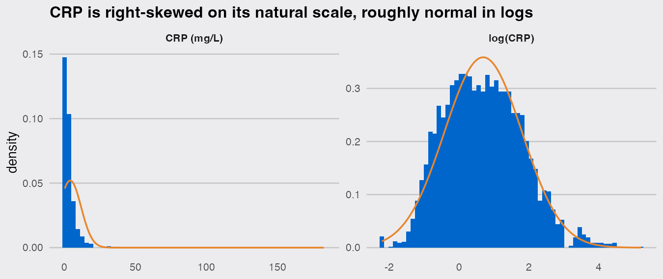
On the raw scale CRP piles up near zero with a long tail (skewness 8.2, and a maximum of 183 mg/L), nothing like the orange normal curve. The median is 1.91 mg/L with an interquartile range of 0.86 to 4.34, while the mean is dragged up to 3.98. Take logs and it becomes the tidy bell on the right. This is the textbook log-normal biomarker, and it will fail a normality test with ease:
shapiro.test(nh$crp)
##
## 	Shapiro-Wilk normality test
##
## data:  nh$crp
## W = 0.40675, p-value < 2.2e-16
What the test says, and why sample size drives it
Before reacting to that p-value, recall what the test claims. shapiro.test() tests the null hypothesis that the sample came from a normal distribution. It reports a statistic W (1 is a perfect match to the normal shape, lower is worse) and a p-value; a small p-value, conventionally below 0.05, is read as evidence against normality. A large p-value does not prove normality, it only means the test found no evidence against it in this sample. That asymmetry is the crux, because whether the test finds evidence depends heavily on how much data you give it.
Watch what happens when I test the same CRP variable at different sample sizes. I draw small samples of 10 and, for contrast, do the same with the near-normal log(CRP). replicate() repeats each draw-and-test 200 times and I report how often the test passes:
set.seed(2026)
pass_rate <- function(x, n) {
  mean(replicate(200, shapiro.test(sample(x, n))$p.value) > 0.05)
}

tibble(
  n = c(10, 50, 4000),
  `CRP passes` = map_dbl(n, (k) pass_rate(nh$crp, k)),
  `log(CRP) passes` = map_dbl(n, (k) pass_rate(log(nh$crp), k))
)
## # A tibble: 3 × 3
##       n `CRP passes` `log(CRP) passes`
##   <dbl>        <dbl>             <dbl>
## 1    10         0.26             0.955
## 2    50         0                0.84
## 3  4000         0                0
Read the table. With only 10 observations, the wildly skewed raw CRP slips past the test a good share of the time: the test simply cannot see gross non-normality in a small sample. By n = 50 it never passes, and at n = 4,000 neither variable passes, not even log(CRP), which looked like a clean bell in the plot above. At large n the test rejects the slight imperfection in log(CRP) just as confidently as the gross skew in raw CRP, because with thousands of points it can detect deviations far too small to matter. A significant Shapiro-Wilk result on a large clinical dataset is almost guaranteed, and it tells you mostly that your sample is large.
So the test alone cannot tell you what to do. The useful questions are about what you want to do with the variable. Here are the three that actually come up.
Question 1: Can I report the mean with a t-based confidence interval?
Short answer: yes for the inference, but describe the variable with the median.
The t-test and its confidence interval do not require the data to be normal. They require the sample mean to be approximately normal across repeated samples, and the central limit theorem delivers that as n grows, whatever the shape of the data. With 4515 observations we are nowhere near the small-sample regime where skew costs anything, so the ordinary interval is trustworthy:
t.test(nh$crp)$conf.int
## [1] 3.760844 4.208325
## attr(,"conf.level")
## [1] 0.95
That interval for the mean CRP is valid despite the skew and the significant normality test. Whether the mean is the summary you want is a separate decision that no test makes for you. For a variable this skewed, the mean (3.98 mg/L) sits well above the typical patient, so a medical paper describes the distribution with the median and IQR (1.91 mg/L, 0.86 to 4.34). If you do want a single central value on the natural scale, the geometric mean, exp(mean(log(crp))) = 2 mg/L, is close to the median and is the honest "average" for a log-normal quantity. The rule of thumb: report the median (IQR) to describe, and if you need to compare group means, trust the t-machinery at this sample size.
Question 2: Can I use it as the outcome in a linear model?
Short answer: yes, but stop testing the raw outcome. Fit the model, then look at the residuals.
This is the most common mistake behind the original question. lm() makes no assumption that your outcome variable is normally distributed. Its normality assumption is about the residuals, and running shapiro.test() on the raw outcome tests something the model never assumed. So fit the model first. Here I predict CRP from BMI, age, and sex, then check the residual QQ plot, the actual diagnostic:
m_raw <- lm(crp ~ bmi + age + sex, data = nh)
m_log <- lm(log(crp) ~ bmi + age + sex, data = nh)
resid_df <- bind_rows(
  tibble(model = "lm(crp ~ ...)", r = scale(residuals(m_raw))[, 1]),
  tibble(model = "lm(log(crp) ~ ...)", r = scale(residuals(m_log))[, 1])
)

ggplot(resid_df, aes(sample = r)) +
  stat_qq(color = dsp_colors[1], size = 0.5) +
  stat_qq_line(color = dsp_colors[2]) +
  facet_wrap(~ fct_inorder(model)) +
  dsp_theme +
  labs(
    title = "Check the residuals, not the raw outcome",
    x = "theoretical quantiles",
    y = "observed quantiles"
  )
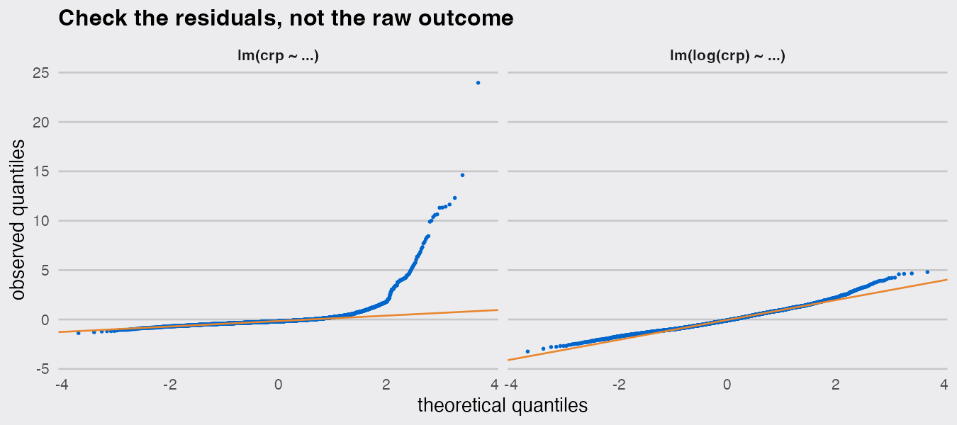
Now the diagnostic earns its keep. Modeling raw CRP leaves residuals that fly off the line (skewness 8.8): the model is dominated by a handful of very high-CRP patients, and its prediction intervals and standard errors are distorted. Modeling log(CRP) brings the residuals back onto the line (skewness 0.58). For CRP the log transform is not a trick to please a test, it is the scale inflammation tends to move on: associations look multiplicative, and the model of log(CRP) reads naturally, a BMI one unit higher is associated with about 7.5% higher CRP on average. Note the sequence: I never tested the outcome for normality. I fit the model and looked at the residuals, which is the assumption that exists.
(Even the raw-CRP model’s coefficients keep the central-limit protection from Question 1, so their confidence intervals are not badly wrong. The reason to prefer log(CRP) is a better fit, honest prediction intervals, and an interpretable coefficient, not the normality test.)
Question 3: Can I use it as a predictor or exposure?
Short answer: yes, with no caveat about normality at all. There is no normality assumption on predictors.
This one is clean. A linear or logistic model assumes nothing whatsoever about the distribution of its predictors, at any sample size. Shapiro-testing an exposure before you model it is testing a rule that does not exist. What a skewed predictor does raise are two real questions: is its relationship with the outcome linear, and do a few extreme values dominate the fit?
Let me use CRP the other way around, as an exposure for systolic blood pressure, adjusting for age and sex:
e_raw <- lm(sbp ~ crp + age + sex, data = nh)
e_log <- lm(sbp ~ log(crp) + age + sex, data = nh)

bind_rows(
  tidy(e_raw, conf.int = TRUE) |> filter(term == "crp"),
  tidy(e_log, conf.int = TRUE) |> filter(term == "log(crp)")
) |>
  select(term, estimate, conf.low, conf.high, p.value)
## # A tibble: 2 × 5
##   term     estimate conf.low conf.high    p.value
##   <chr>       <dbl>    <dbl>     <dbl>      <dbl>
## 1 crp        0.0221  -0.0417    0.0859 0.498
## 2 log(crp)   0.998    0.556     1.44   0.00000984
exp_df <- bind_rows(
  transmute(nh, scale = "CRP (mg/L, raw)", x = crp, sbp),
  transmute(nh, scale = "log(CRP)", x = log(crp), sbp)
)

ggplot(exp_df, aes(x, sbp)) +
  geom_point(alpha = 0.12, color = dsp_colors[1], size = 0.5) +
  geom_smooth(
    method = "lm",
    formula = y ~ x,
    color = dsp_colors[2],
    se = FALSE
  ) +
  facet_wrap(~ fct_inorder(scale), scales = "free_x") +
  dsp_theme +
  labs(
    title = "As an exposure, the fix is functional form, not normality",
    x = NULL,
    y = "systolic BP (mmHg)"
  )
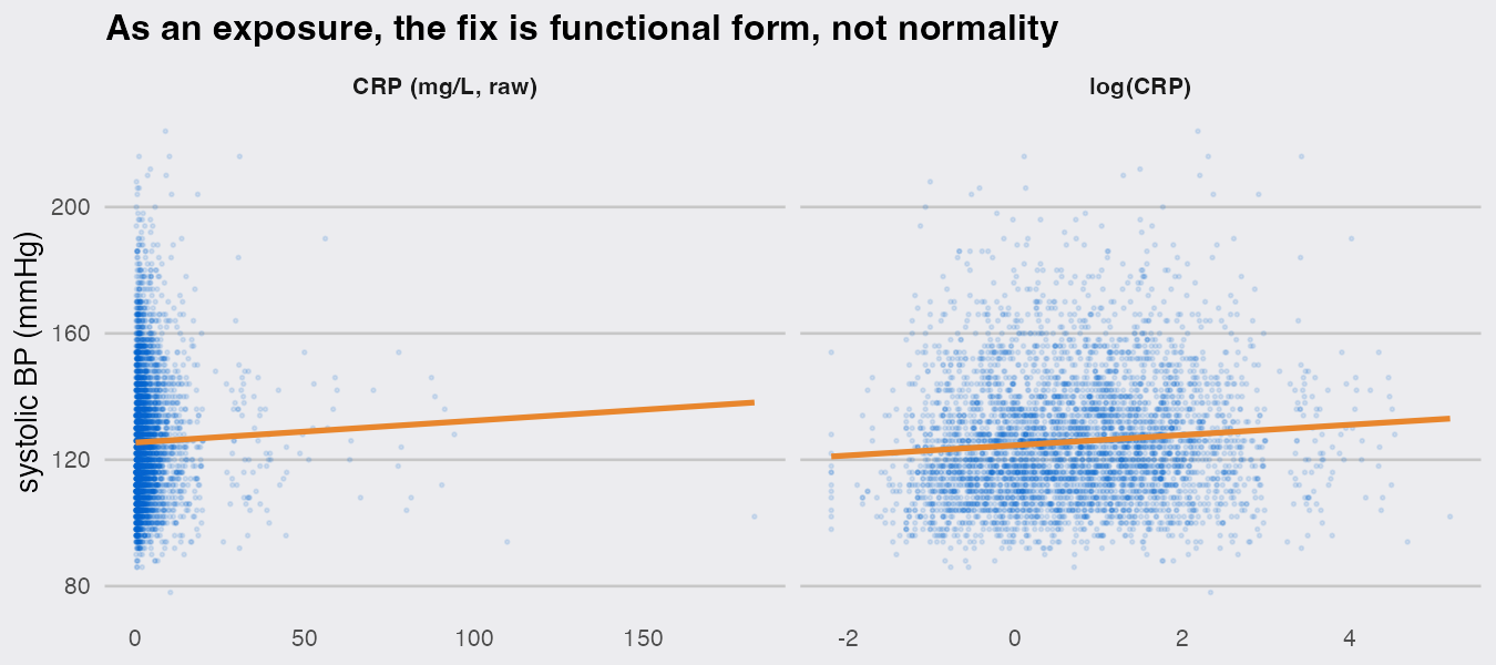
The two models disagree sharply. Entered raw, CRP shows essentially no association with blood pressure (p = 0.5): the left panel shows why, almost every patient is squashed against the axis while a few extreme values up to 183 mg/L anchor the line, so a straight fit through raw CRP is close to meaningless. Entered as log(CRP), the same data shows a clear association, roughly 1 mmHg higher systolic BP per unit of log CRP, with a confidence interval well away from zero. Nothing about normality changed between the two models. What changed was the functional form: CRP relates to blood pressure on a multiplicative scale, and forcing a linear-in-raw-CRP relationship hid the association. The lesson for a skewed exposure is to think about its scale and its influential extreme values, never to test it for normality.
Summary
When a biomarker fails a normality test, the test has mostly told you your sample is large. What you do next depends on the role the variable plays, and none of the three answers is "abandon the linear model":
- Reporting a center: describe a skewed biomarker with the median and IQR; the t-based interval for a mean is still valid at any real epidemiological sample size, and the geometric mean is the natural average on the log scale.
- As an outcome: never Shapiro-test the raw outcome. Fit the model and read the residual QQ plot. For CRP that points to a log transform, chosen for fit and interpretability, not to satisfy a test.
- As a predictor or exposure: there is no normality assumption to violate. Worry about functional form (a log or a spline) and influential extreme values instead.
Underneath all three is the same fact: the linear model cares about the behavior of the sample mean and the residuals, and the central limit theorem protects both at the sample sizes real studies have. The normality test looks at neither.
That’s it. I hope you find this tutorial useful, and if you have questions, leave a comment below.


