When you download data from the World Bank, you get a wide dataset: one row per country and one column per year, from 1960 to 2025. This shape is not usable for analysis. ggplot2 cannot plot it, and dplyr cannot group or filter by year, because "year" is not a column — it is 66 column names. What you need is the long format: one row per country per year.
Converting wide data to long is one of the most common data manipulation tasks in R, and tidyr::pivot_longer() does it in one call. In this tutorial I will reshape the real World Bank life expectancy file, including its real-world quirks: junk header lines, an empty last column, and aggregate rows mixed in with the countries. At the end I use the reshaped data to see how COVID-19 changed life expectancy across regions, and which countries have still not recovered.
I will use three tidyverse packages plus ggplot2, all on CRAN.
library(readr)
library(dplyr)
library(tidyr)
library(ggplot2)
Getting the data
The World Bank serves any indicator as a zip of CSVs from a single URL. No API key, no registration. The indicator code for life expectancy at birth is SP.DYN.LE00.IN. You can swap in any other indicator — CO₂ emissions, GDP, fertility — and the rest of the code stays the same.
url <- paste0("https://api.worldbank.org/v2/en/indicator/",
              "SP.DYN.LE00.IN?downloadformat=csv")
zipfile <- file.path(tempdir(), "le.zip")
download.file(url, zipfile, mode = "wb", quiet = TRUE)
files <- unzip(zipfile, exdir = tempdir())
basename(files)
## [1] "Metadata_Indicator_API_SP.DYN.LE00.IN_DS2_en_csv_v2_408.csv"
## [2] "API_SP.DYN.LE00.IN_DS2_en_csv_v2_408.csv"
## [3] "Metadata_Country_API_SP.DYN.LE00.IN_DS2_en_csv_v2_408.csv"
Two of the three files matter. The API_... file is the data, and Metadata_Country_... describes each row — I will use it later to separate real countries from aggregates like World and Euro area.
The data file does not start with data. The first four lines are notes ("Data Source", "Last Updated Date", …), so I tell read_csv() to skip them.
data_file <- files[grepl("^API_", basename(files))]
wide <- read_csv(data_file, skip = 4)
dim(wide)
## [1] 265  71
A first look at the data
The dataset has 265 rows and 71 columns. Let’s check the column names:
names(wide)[c(1:6, 68:71)]
##  [1] "Country Name"   "Country Code"   "Indicator Name" "Indicator Code" "1960"
##  [6] "1961"           "2023"           "2024"           "2025"           "...71"
There are three problems, and all of them are typical of real-world wide files:
- Years are column names.
1960…2025are 66 separate columns, so "year" is not a variable you can filter, group, or map to an axis. - An empty last column. Every line in the CSV ends with a trailing comma, so
read_csv()creates an unnamed final column (...71) that is entirelyNA. - Constant columns.
Indicator NameandIndicator Coderepeat the same value in every row. I will drop them.
Reshape with pivot_longer()
pivot_longer() needs three things: the columns to stack (here, everything except the two identifier columns), a name for the new key column, and a name for the new value column. Two extra arguments are worth knowing. names_transform converts the year names from text to integers as they become data, and values_drop_na = TRUE drops the empty cells (Monaco has no 1960 value, and 2025 has no values at all yet).
long <- wide |>
  select(-`Indicator Name`, -`Indicator Code`, -last_col()) |>
  pivot_longer(
    cols            = -c(`Country Name`, `Country Code`),
    names_to        = "year",
    values_to       = "life_exp",
    names_transform = as.integer,
    values_drop_na  = TRUE
  )
long
## # A tibble: 17,126 × 4
##    `Country Name` `Country Code`  year life_exp
##    <chr>          <chr>          <int>    <dbl>
##  1 Aruba          ABW             1960     64.0
##  2 Aruba          ABW             1961     64.2
##  3 Aruba          ABW             1962     64.6
##  4 Aruba          ABW             1963     64.9
##  5 Aruba          ABW             1964     65.3
##  6 Aruba          ABW             1965     65.6
##  7 Aruba          ABW             1966     66.1
##  8 Aruba          ABW             1967     66.4
##  9 Aruba          ABW             1968     66.7
## 10 Aruba          ABW             1969     67.1
## # ℹ 17,116 more rows
71 columns became 4, with 17,126 country-year observations from 1960 to 2024. This is tidy data. Every dplyr verb and every ggplot aesthetic now works directly.
Remove the rows that are not countries
264 "countries" is suspicious — the UN has 193 members. The World Bank mixes aggregate rows (World, European Union, income groups, regions) into the same file. The metadata CSV identifies them: aggregates have an empty Region field. An inner_join() keeps the real countries and attaches each country’s region at the same time.
meta_file <- files[grepl("^Metadata_Country", basename(files))]
meta <- read_csv(meta_file)

countries <- long |>
  inner_join(meta |> filter(!is.na(Region)) |>
               select(`Country Code`, Region),
             by = "Country Code")
n_distinct(countries$`Country Code`)
## [1] 217
Now the data has 217 actual countries. The aggregate rows are not garbage, though. For the next plot I want regional averages, and the World Bank has already computed them — so I take its regional aggregates from long by their codes instead of recomputing them.
Plot the reshaped data
Before plotting, I define a color vector and a few lines of theme() on top of theme_minimal(), so both figures share the same look — a light gray panel with white gridlines. You can reuse this snippet or leave plain theme_minimal().
dsp_colors <- c("#0066CC", "#E8862D", "#159A6C", "#7D5BD6",
                "#D64580", "#2AA9B8", "#C9A227")

dsp_theme <- theme_minimal(base_size = 13) +
  theme(
    panel.background = element_rect(fill = "#F5F5F7", color = NA),
    panel.grid       = element_line(color = "white"),
    axis.ticks       = element_blank(),
    plot.title       = element_text(face = "bold")
  )

regions <- c(EAS = "East Asia & Pacific",   ECS = "Europe & Central Asia",
             LCN = "Latin America & Carib.", MEA = "Middle East & N. Africa",
             NAC = "North America",          SAS = "South Asia",
             SSF = "Sub-Saharan Africa")

reg <- long |>
  filter(`Country Code` %in% names(regions)) |>
  mutate(region = regions[`Country Code`])

ggplot(reg, aes(year, life_exp, color = region)) +
  annotate("rect", xmin = 2019.5, xmax = 2021.5, ymin = -Inf, ymax = Inf,
           alpha = .12, fill = "red") +
  geom_line(linewidth = .8) +
  scale_x_continuous(breaks = seq(1960, 2020, 20)) +
  labs(title    = "Life expectancy by region, 1960–2024",
       subtitle = "Shaded band: the COVID-19 years",
       x = NULL, y = "Life expectancy at birth (years)", color = NULL) +
  scale_color_manual(values = dsp_colors) +
  dsp_theme
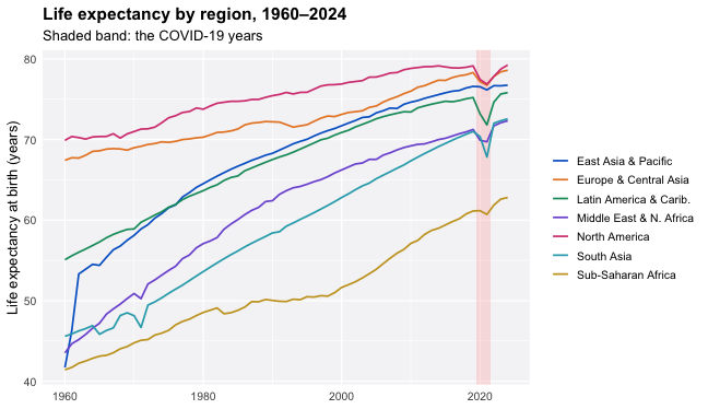
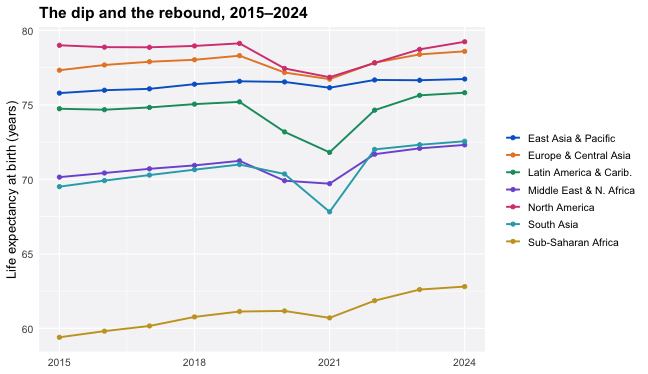
Sixty years of nearly uninterrupted progress, and one sharp dip. Let’s zoom into the last decade — the dip is not the same everywhere:
ggplot(filter(reg, year >= 2015), aes(year, life_exp, color = region)) +
  geom_line(linewidth = .9) +
  geom_point(size = 1.6) +
  scale_x_continuous(breaks = seq(2015, 2024, 3)) +
  labs(title = "The dip and the rebound, 2015–2024",
       x = NULL, y = "Life expectancy at birth (years)", color = NULL) +
  scale_color_manual(values = dsp_colors) +
  dsp_theme
Three things stand out:
- The world lost 1.7 years of life expectancy between 2019 (72.9) and the 2021 low point (71.2) — roughly a decade of progress erased in two years. By 2024 it recovered to 73.5, above the pre-pandemic level.
- Latin America fell hardest (−3.4 years by 2021). South Asia’s drop came a year later, in 2021 with the Delta wave. Sub-Saharan Africa barely dipped — its population is young, and the virus was deadliest to the old.
- The rebound is real but uneven. One more reshape will show it.
Back to wide with pivot_wider()
The inverse operation is useful when you want to compare two years side by side. To ask which countries are still below their pre-COVID level, I put 2019 and 2024 back into columns and subtract:
recovery <- countries |>
  filter(year %in% c(2019, 2024)) |>
  pivot_wider(names_from = year, values_from = life_exp,
              names_prefix = "y") |>
  mutate(delta = y2024 - y2019)

recovery |>
  arrange(delta) |>
  select(`Country Name`, y2019, y2024, delta) |>
  head(5)
## # A tibble: 5 × 4
##   `Country Name`     y2019 y2024  delta
##   <chr>              <dbl> <dbl>  <dbl>
## 1 West Bank and Gaza  75.8  69.2 -6.60
## 2 Libya               72.9  71.1 -1.82
## 3 Greenland           71.4  70.3 -1.14
## 4 Thailand            77.2  76.6 -0.633
## 5 Macao SAR, China    83.9  83.3 -0.598
20 of 217 countries remain below their 2019 life expectancy in 2024. The largest gap, West Bank and Gaza at −6.6 years, is not a COVID story at all — it is the war. Once the data has the right shape, questions like this take three lines.
Summary
The whole workflow is four steps: read_csv(skip = 4) to get past the header lines, pivot_longer() with names_transform and values_drop_na to stack the year columns, an inner_join() with the metadata file to separate countries from aggregates, and pivot_wider() when a comparison needs columns again. The same four steps work on any World Bank indicator — change one code in the URL — and on most wide files you will meet in practice, because the problems are always the same: years as columns, trailing commas, and totals hiding among the rows.
That’s it — I hope you find this tutorial useful. If you have questions, leave a comment below.

