It’s time to branch out into a new area of data visualisation: proportion area plots. These plots use area to show proportion between different related values. A common type of proportional area plots are tree maps. We are going to be using the same principle but with circles.
A common subject for area visualisation is budgets and money, which will be the subject of this post.
We are going to take a look at the Spring Budget 2017 in the UK.
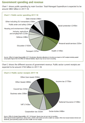
Page four of the document has two pie charts detailing how public money will be spent this year and where it will come from.
I couldn’t find this data in any tables, so we will have to create our data frames manually:
 spending <- data.frame(c("Social protection","Health","Education","Other","Defence","Debt interest","Transport","Housing\n & environment","Public order","Social\n services","Industry"),
 c(245,149,102,50,48,46,37,36,34,32,23),
 c(802,802,802,802,802,802,802,802,802,802,802))
 names(spending) <- c("Expenditure","Spending","Total")
income <- data.frame(c("Income tax","VAT","National Insurance", "Other taxes","Borrowing","Other (non taxes)","Corporation Tax","Excise duties","Council tax","Business\n rates"),
 c(175,143,130,80,58,54,52,48,32,30),
 c(802,802,802,802,802,802,802,802,802,802))
 names(income) <- c("Source","Income","Total")
I am including ‘borrowing’ in the Government’s income section, although it will be the only circle that won’t be a tax.
To draw our circles we will be using the packcircles package.
library("packcircles")
library("ggplot2")
options(scipen = 999)
library(extrafont)
library(extrafontdb)
loadfonts()
fonts()

t <- theme_bw() +
 theme(panel.grid = element_blank(),
 axis.text=element_blank(),
 axis.ticks=element_blank(),
 axis.title=element_blank())
The first thing to do is to use the functions within the package to generate the radii and coordinates, as per this code here.
# circle areas
areas <- income$Income
areas2 <- spending$Spending
# income
packing1 <- circleProgressiveLayout(areas)
dat1 <- circleLayoutVertices(packing1)
# spending
packing2 <- circleProgressiveLayout(areas2)
dat2 <- circleLayoutVertices(packing2)
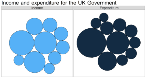
Next up we are going to move to the visualisation. It would be more informative if we could display income and expenditure side-by-side.
Like last time when we compared Donald Trump and Hillary Clinton on Facebook, we can use facetting for this purpose in ggplot2.
I adapted this code for this purpose.
dat <- rbind(
cbind(dat1, set = 1),
cbind(dat2, set = 2) )
p <- ggplot(data = dat, aes(x, y)) +
geom_polygon(aes(group = id, fill = -set),
colour = "black", show.legend = FALSE) + theme(text = element_text(family="Browallia New", size = 50)) +
coord_equal() + ggtitle("Income and expenditure for the UK Government") +
scale_colour_manual(values = c("white","White")) +
facet_grid(~set,
labeller = as_labeller(
c('1' = "Income", '2' = "Expenditure")))
This is looking good, but obviously we have no way of knowing which circle corresponds to which area of income or expenditure. In ggplot2 you can use geom_text() to add annotations. In order for them to be positioned correctly, we need to build a relationship between the labels and the circles. We can do this by creating centroids from the coordinates we already have for the circles.
If we have accurate centroid coordinates then our labels will always appear in the centre of our circles.
Going back to our dat data frame:
str(dat)
> str(dat)'data.frame': 546 obs. of  4 variables:
$ x  : num  0 -0.277 -1.092 -2.393 -4.099 ...
$ y  : num  0 2.2 4.25 6.05 7.46 ...
$ id : int  1 1 1 1 1 1 1 1 1 1 ...
$ set: num  1 1 1 1 1 1 1 1 1 1 ...
Our ID column shows which circle it belongs to, and our set column shows whether it belongs in income or expenditure. From this we can deduce that each circle is plotted using 26 pairs of x/y coordinates (at row 27 the ID changes from one to two).
The mean of each 26 pairs is the centre of the corresponding circle.
Our dat data frame is 546 rows long. We need a sequence of numbers, 26 apart, going up to 546:
sequence <- data.frame(c(x = (seq(from = 1, to = 546, by = 26))), y = seq(from = 26, to = 547, by = 26))
names(sequence)  head(sequence)
 x y
 x1 1 26
 x2 27 52
 x3 53 78
 x4 79 104
 x5 105 130
 x6 131 156
Next up we will create a data frame that will contain our centroids:
centroid_df <- data.frame(seq(from = 1, to = 521, by = 1))
names(centroid_df) <- c("number")
There are probably a few different ways to run the next section, probably a bit more elegantly than what we’re about to do as well.
This for loop will calculate the mean of every single combination of 26 coordinates and store the results in the new centroid_df.
for (i in 1:521) {
      j = i + 25
      centroid_df$x[i] <- mean(dat$x[i:j])
      centroid_df$y[i] <- mean(dat$y[i:j])
 }
Now we bring in our sequence data frame to filter out the ones we don’t need in a new coords data frame, leaving just the ones that correspond correctly to the circles:
coords <- merge(sequence,centroid_df, by.x = "x", by.y = "number")
names(coords) <- c("number1","number2","x","y")
Next up for labelling purposes is to clarify which set each pair of coordinates belongs to:
coords$set[1:21] <- 1
coords$set[11:21] <- 2 #this overrides some of the values set in the line above
Finally we will paste in the names and amounts from our original income and spending data frames into a new label column:
coords$label <- NA
coords$label[1:21] <- paste(income$Source,"\n£",income$Income,"bn")
coords$label[11:21] <- paste(spending$Expenditure,"\n£",spending$Spending,"bn")
coords$label <- gsub("£ ","£",coords$label)
coords$label <- gsub(" bn","bn",coords$label)
Now let’s add in the labels:
p <- p+ geom_text(data = coords, aes(x = x, y = y, label = label, colour = factor(set)),show.legend = FALSE)
p
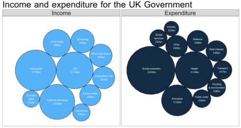
There we have it, some nicely formatted labels showing what each circle refers to, and how much money it represents.
Brief analysis
On the left hand side we see that income tax is the biggest cash cow for the Government. Incidentally, about 28 per cent of that is paid for by the top 1% of earners:
The top 5% are liable for almost half the UK's total income tax.
Not enough for Jeremy Corbyn, so what would he like it to be? pic.twitter.com/poeC2N6Sn9
— Rob Grant (@robgrantuk) June 21, 2017
Social protection means benefits, essentially. A huge chunk of that is the State Pension, followed by various working-age benefits and tax credits.
Notice that as a country we spend almost as much paying off the interest on our debts as we do on our own defence.
Health and education – those two ‘classic’ public services – cost a combined £250bn.
Conclusion
I am a fan of using these circles to visualise this kind of data, especially money.
If you have lots of networked data (for instance, if you had breakdowns of how exactly the social protection budget will be spent) then ggraph would be a good option for you to produce plots like this:

Comment below if you have questions!


