In this post we will see how to include the effect of predictors in non-linear regressions. In other words, letting the parameters of non-linear regressions vary according to some explanatory variables (or predictors). Be sure to check the first post on this if you are new to non-linear regressions.
The example that I will use throughout this post is the logistic growth function, it is often used in ecology to model population growth. For instance, say you count the number of bacteria cells in a petri dish, in the beginning the cell counts will increase exponentially but after some time due to limits in resources (be it space or food), the bacteria population will reach an equilibrium. This will produce the classical S-shaped, non-linear, logistic growth function. The logistic growth function has three parameters: the growth rate called “r”, the population size at equilibrium called “K” and the population size at the beginning called “n0”.
First Example: Categorical Predictor
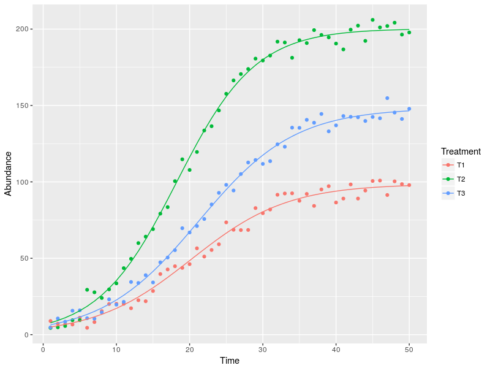
Say that we want to test the effect of food quality on the population dynamic of our bacteria. To do so we use three different type of food and we count the number of bacteria over time. Here is how to code this in R using the function nlsList from the package nlme:
#load libraries
library(nlme)
#first try effect of treatment on logistic growth
Ks <- c(100,200,150)
n0 <- c(5,5,6)
r <- c(0.15,0.2,0.15)
time <- 1:50
#this function returns population dynamics following
#a logistic curves
logF <- function(time,K,n0,r){
  d <- K * n0 * exp(r*time) / (K + n0 * (exp(r*time) - 1))
  return(d)
}
#simulate some data
dat <- data.frame(Treatment=character(),Time=numeric(),
                  Abundance=numeric())
for(i in 1:3){
  Ab <- logF(time = time,K=Ks[i],n0=n0[i],r=r[i])
  tmp <- data.frame(Treatment=paste0("T",i),Time=time,
                    Abundance=Ab+rnorm(time,0,5))
  #note that random deviates were added to the simulated
  #population density values
  dat <-rbind(dat,tmp)
}
#the formula for the models
lF<-formula(Abundance~K*n0*exp(r*Time)/(K+n0*(exp(r*Time)-1)) | Treatment)

#fit the model
(m <- nlsList(lF,data=dat,start=list(K=150,n0=10,r=0.5)))
Call:
  Model: Abundance ~ K * n0 * exp(r * Time)/(K + n0 * (exp(r * Time) - 1)) | Treatment
   Data: dat

Coefficients:
          K       n0         r
T1 105.2532 4.996502 0.1470740
T2 199.5149 4.841359 0.2006150
T3 150.2882 5.065196 0.1595293

Degrees of freedom: 150 total; 141 residual
Residual standard error: 5.085229
The code simulated population values using three sets of parameters (the r, K and n0’s). Then we specified the non-linear regression formula, using the pipe “|” symbol to explicitly ask for fitting different parameters to each Treatment. The model output gives us the estimated parameters for each Treatment. We can now plot the model predictions against the real data:
#derive the predicted lines
dat$Pred <-predict(m)
#plot
ggplot(dat,aes(x=Time,y=Abundance,color=Treatment))+
       geom_point()+geom_line(aes(y=Pred))
Second Example: Continuous Predictor
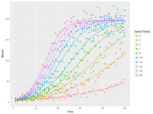
We can also model the effect of continuous predictors on the parameters of the non-linear regression. For instance, we might assume that bacterial colonies grow faster in warmer temperature. In this case we could model the effect of temperature on growth rate (assuming that it is linear) and use the fitted growth rate to model the number of bacteria, all this within one model, pretty neat.
To do so I will use another package: bbmle and its function mle2:
#load libraries
library(bbmle)
library(reshape2)
#parameter for simulation
K <- 200
n0 <- 5
#the gradient in temperature
Temp <- ceiling(seq(0,20,length=10))


#simulate some data
mm <- sapply(Temp,function(x){
             rpois(50,logF(time = 1:50,K = K,n0=n0,r = 0.05 + 0.01 * x))})
#sample data from a poisson distribution with lambda parameter equal
#to the expected value, note that we do not provide one value for the
#parameter r but a vector of values representing the effect of temperature
#on r
#some reshaping
datT <- melt(mm)
names(datT) <- c("Time","Temp","Abund")
datT$Temp <- Temp[datT$Temp]

#fit the model
(mll <- mle2(Abund~dpois(K*n0*exp(r*Time)/(K+n0*(exp(r*Time)-1))),
             data=datT,parameters = list(r~Temp),
             start=list(K=100,n0=10,r=0.05)))
Call:
mle2(minuslogl = Abund ~ dpois(K * n0 * exp(r * Time)/(K + n0 *
    (exp(r * Time) - 1))), start = list(K = 100, n0 = 10, r = 0.05),
    data = datT, parameters = list(r ~ Temp))

Coefficients:
            K            n0 r.(Intercept)        r.Temp
 200.13176811    4.60546966    0.05195730    0.01016994

Log-likelihood: -1744.01
The first argument for mle2 is either a function returning the negative log-likelihood or a formula of the form “response ~ some distribution(expected value)”. In our case we fit a poisson distribution with expected values coming form the logistic equation and its three parameters. The dependency between the growth rate and the temperature is given using the “parameter” argument. The basic model output gives us all the estimated parameters, of interest here are the “r.(Intercept)” which is the growth rate when the temperature is at 0 and “r.Temp” which is the increase in the growth rate for every increase of temperature by 1.
Again we can get the fitted values for plotting:
datT$pred <- predict(mll)
ggplot(datT,aes(x=Time,y=Abund,color=factor(Temp)))+
       geom_point()+geom_line(aes(y=pred))
Third Example: More on Continuous Predictors
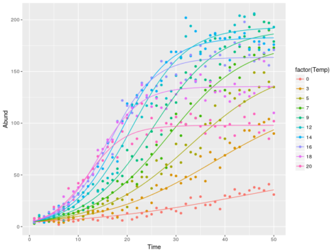
The cool thing with mle2 is that you can fit any models that you can imagine, as long as you are able to write down the log-likelihood functions. We will see this with an extension of the previous model. It is a common assumption in biology that species should have some optimum temperature, hence we can expect a bell-shape relation between population equilibrium and temperature. So we will add to the previous model a quadratic relation between the population equilibrium (“K”) and temperature.
#simulate some data
mm <- sapply(Temp,function(x){
 rpois(50,logF(time = 1:50,K = 100+20*x-x**2,n0=n0,r = 0.05 + 0.01 * x))})
#note that this time both K and r are given as vectors to represent their
#relation with temperature

#some reshaping
datT <- melt(mm)
names(datT) <- c("Time","Temp","Abund")
datT$Temp <- Temp[datT$Temp]

#the negative log-likelihood function
LL <- function(k0,k1,k2,n0,r0,r1){
  K <- k0 + k1*Temp + k2*Temp**2
  r <- r0 + r1*Temp
  lbd <- K*n0*exp(r*Time)/(K+n0*(exp(r*Time)-1))
  -sum(dpois(Abund,lbd,log=TRUE))
}

(mll2 <- mle2(LL,data=datT,start=list(k0=100,k1=1,k2=-0.1,n0=10,r0=0.1,r1=0.1)))
Call:
mle2(minuslogl = LL, start = list(k0 = 100, k1 = 1, k2 = -0.1,
    n0 = 10, r0 = 0.1, r1 = 0.1), data = datT)

Coefficients:
          k0           k1           k2           n0           r0           r1
100.47610915  20.09677780  -1.00836974   4.84940342   0.04960558   0.01018838

Log-likelihood: -1700.91
This time I defined the negative log-likelihood function to fit the model. This function takes as argument the model parameter. In this case we have 3 parameters to describe the quadratic relation between K and temperature, 1 parameter for the constant n0 and 2 parameters to describe the linear relation between r and temperature. The important thing to understand is what the last line is doing. Basically the dpois call return the probabilities to get the observed abundance values (“Abund”) based on the expected mean value (“lbd”). The LL function will return a single negative log-likelihood value (the sum) and the job of mle2 is to minimize this value. To do so mle2 will try many different parameter combination each time calling the LL function and when it reaches the minimum it will return the parameter set used. This is Maximum Likelihood Estimation (MLE). As before the model output gives us the estimated parameters, and we can use these to plot the fitted regressions:
cc <- coef(mll2)
#sorry for the awful coding, to get the model predicted values we need
#to code the relation by hand which is rather clumsy ...
datT$pred <- melt(sapply(Temp,function(x) {logF(time=1:50,K=cc[1]+cc[2]*x+cc[3]*x**2,n0=cc[4],r=cc[5]+cc[6]*x)}))[,3]
ggplot(datT,aes(x=Time,y=Abund,color=factor(Temp)))+
       geom_point()+geom_line(aes(y=pred))
Conclusion
I showed three way by which you can include the effect of predictors on the parameters of some non-linear regression: nlsList, mle2 with formula and mle2 with customized negative log-likelihood function. The first option is super easy and might be enough in many cases, while the last option though more complex gives you (almost) infinite freedom in the models that you can fit.
Happy non-linear modelling!


