This tutorial was inspired by a this post published at DataScience+ by Bidyut Ghosh. Special thanks also to Dani Navarro, The University of New South Wales (Sydney) for the book Learning Statistics with R (hereafter simply LSR) and the lsr packages available through CRAN. I highly recommend it.
Let’s load the required R packages
library(ggplot2)
library(lsr)
library(psych)
library(car)
library(tidyverse)
library(dunn.test)
library(BayesFactor)
library(scales)
library(knitr)
library(kableExtra)
options(width = 130)
options(knitr.table.format = "html")
The Oneway Analysis of Variance (ANOVA)
The Oneway ANOVA is a statistical technique that allows us to compare mean differences of one outcome (dependent) variable across two or more groups (levels) of one independent variable (factor). If there are only two levels (e.g. Male/Female) of the independent (predictor) variable the results are analogous to Student’s t-test. It is also true that ANOVA is a special case of the GLM or regression models so as the number of levels increases it might make more sense to try one of those approaches. ANOVA also allows for comparisons of mean differences across multiple factors (Factorial or Nway ANOVA) which we won’t address here.
Our scenario and data
Professor Ghosh’s original scenario can be summarized this way. Imagine that you are interested in understanding whether knowing the brand of car tire can help you predict whether you will get more or less mileage before you need to replace them. We’ll draw what is hopefully a random sample of 60 tires from four different manufacturers and use the mean mileage by brand to help inform our thinking. While we expect variation across our sample we’re interested in whether the differences between the tire brands (the groups) is significantly different than what we would expect in random variation within the groups.
Our research or testable hypothesis is then described \[\mu_{Apollo} \ne \mu_{Bridgestone} \ne \mu_{CEAT} \ne \mu_{Falken}\] as at least one of the tire brand populations is different than the other three. Our null is basically “nope, brand doesn’t matter in predicting tire mileage – all brands are the same”.
He provides the following data set with 60 observations. I’ve chosen to download directly but you could of course park the file locally and work from there.
| Column | Contains | Type |
|---|---|---|
| Brands | What brand tyre | factor |
| Mileage | Tyre life in thousands | num |
tyre<-read.csv("https://datascienceplus.com/wp-content/uploads/2017/08/tyre.csv")
# tyre<-read.csv("tyre.csv") # if you have it on your local hard drive
str(tyre)
## 'data.frame':    60 obs. of  2 variables:
##  $ Brands : Factor w/ 4 levels "Apollo","Bridgestone",..: 1 1 1 1 1 1 1 1 1 1 ...
##  $ Mileage: num  33 36.4 32.8 37.6 36.3 ...
summary(tyre)
##          Brands      Mileage
##  Apollo     :15   Min.   :27.88
##  Bridgestone:15   1st Qu.:32.69
##  CEAT       :15   Median :34.84
##  Falken     :15   Mean   :34.74
##                   3rd Qu.:36.77
##                   Max.   :41.05
head(tyre)
##   Brands Mileage
## 1 Apollo  32.998
## 2 Apollo  36.435
## 3 Apollo  32.777
## 4 Apollo  37.637
## 5 Apollo  36.304
## 6 Apollo  35.915
View(tyre) if you use RStudio this is a nice way to see the data in spreadsheet format
The data set contains what we expected. The dependent variable Mileage is numeric and the independent variable Brand is of type factor. R is usually adept at coercing a chr string or an integer as the independent variable but I find it best to explicitly make it a factor when you’re working on ANOVAs.
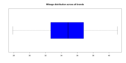
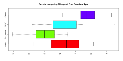
Let’s graph and describe the basics. First a simple boxplot of all 60 data points along with a summary using the describe command from the package psych. Then in reverse order lets describe describeBy and boxplot breaking it down by group (in our case tire brand).
boxplot(tyre$Mileage,
        horizontal = TRUE,
        main="Mileage distribution across all brands",
        col = "blue")

describe(tyre) # the * behind Brands reminds us it's a factor and some of the numbers are nonsensical
##         vars  n  mean   sd median trimmed  mad   min   max range  skew kurtosis   se
## Brands*    1 60  2.50 1.13   2.50    2.50 1.48  1.00  4.00  3.00  0.00    -1.41 0.15
## Mileage    2 60 34.74 2.98  34.84   34.76 3.09 27.88 41.05 13.17 -0.11    -0.44 0.38
describeBy(tyre$Mileage,group = tyre$Brand, mat = TRUE, digits = 2)
##     item      group1 vars  n  mean   sd median trimmed  mad   min   max range  skew kurtosis   se
## X11    1      Apollo    1 15 34.80 2.22  34.84   34.85 2.37 30.62 38.33  7.71 -0.18    -1.24 0.57
## X12    2 Bridgestone    1 15 31.78 2.20  32.00   31.83 1.65 27.88 35.01  7.13 -0.29    -1.05 0.57
## X13    3        CEAT    1 15 34.76 2.53  34.78   34.61 2.03 30.43 41.05 10.62  0.64     0.33 0.65
## X14    4      Falken    1 15 37.62 1.70  37.38   37.65 1.18 34.31 40.66  6.35  0.13    -0.69 0.44
boxplot(tyre$Mileage~tyre$Brands,
        main="Boxplot comparing Mileage of Four Brands of Tyre",
        col= rainbow(4),
        horizontal = TRUE)
Let’s format the table describeby generates to make it a little nicer using the kable package. Luckily describeby generates a dataframe with mat=TRUE and after that we can select which columns to publish (dropping some of the less used) as well as changing the column labels as desired.
describeBy(tyre$Mileage,group = tyre$Brand, mat = TRUE) %>% #create dataframe
  select(Brand=group1, N=n, Mean=mean, SD=sd, Median=median, Min=min, Max=max,
                Skew=skew, Kurtosis=kurtosis, SEM=se) %>%
  kable(align=c("lrrrrrrrr"), digits=2, row.names = FALSE,
        caption="Tire Mileage Brand Descriptive Statistics") %>%
  kable_styling(bootstrap_options=c("bordered", "responsive","striped"), full_width = FALSE)
| Brand | N | Mean | SD | Median | Min | Max | Skew | Kurtosis | SEM |
|---|---|---|---|---|---|---|---|---|---|
| Apollo | 15 | 34.80 | 2.22 | 34.84 | 30.62 | 38.33 | -0.18 | -1.24 | 0.57 |
| Bridgestone | 15 | 31.78 | 2.20 | 32.00 | 27.88 | 35.01 | -0.29 | -1.05 | 0.57 |
| CEAT | 15 | 34.76 | 2.53 | 34.78 | 30.43 | 41.05 | 0.64 | 0.33 | 0.65 |
| Falken | 15 | 37.62 | 1.70 | 37.38 | 34.31 | 40.66 | 0.13 | -0.69 | 0.44 |
Certainly much nicer looking and I only scratched the surface of the options available. We can certainly look at the numbers and learn a lot. But let’s see if we can also improve our plotting to be more informative.
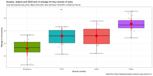
The more I use ggplot2 the more I love the ability to use it to customize the presentation of the data to optimize understanding! The next plot might be accused of being a little “busy” but essentially answers our Oneway ANOVA question in one picture (note that I have stayed with the original decision to set \(\alpha\) = 0.01 significance level (99% confidence intervals)).
ggplot(tyre, aes(reorder(Brands,Mileage),Mileage,fill=Brands))+
# ggplot(tyre, aes(Brands,Mileage,fill=Brands))+ # if you want to leave them alphabetic
  geom_jitter(colour = "dark gray",width=.1) +
  stat_boxplot(geom ='errorbar',width = 0.4) +
  geom_boxplot()+
  labs(title="Boxplot, dotplot and SEM plot of mileage for four brands of tyres",
       x = "Brands (sorted)",
       y = "Mileage (in thousands)",
       subtitle ="Gray dots=sample data points, Black dot=outlier, Blue dot=mean, Red=99% confidence interval",
       caption = "Data from https://datascienceplus.com/one-way-anova-in-r/") +
  guides(fill=FALSE) +
  stat_summary(fun.data = "mean_cl_normal", colour = "red", size = 1.5, fun.args = list(conf.int=.99)) +
  stat_summary(geom="point", fun.y=mean, color="blue") +
  theme_bw()
By simple visual inspection it certainly appears that we have evidence of the effect of tire brand on mileage. There is one outlier for the CEAT brand but little cause for concern. Means and medians are close together so no major concerns about skewness. Different brands have differing amounts of variability but nothing shocking visually.
Oneway ANOVA Test & Results
So the heart of this post is to actually execute the Oneway ANOVA in R. There are several ways to do so but let’s start with the simplest from the base R first aov. While it’s possible to wrap the command in a summary or print statement I recommend you always save the results out to an R object in this case tyres.aov. It’s almost inevitable that further analysis will ensue and the tyres.aov object has a wealth of useful information. If you’re new to R a couple of quick notes. The dependent variable goes to the left of the tilde and our independent or predictor variable to the right. aov is not limited to Oneway ANOVA so adding additional factors is possible.
As I mentioned earlier ANOVA is a specialized case of the GLM and therefore the list object returned tyres.aov is actually of both aov and lm class. The names command will give you some sense of all the information contained in the list object. We’ll access some of this later as we continue to analyze our data. The summary command gives us the key ANOVA data we need and produces a classic ANOVA table. If you’re unfamiliar with them and want to know more especially where the numbers come from I recommend a good introductory stats text. As noted earlier I recommend Learning Statistics with R LSR see Table 14-1 on page 432.
tyres.aov<- aov(Mileage~Brands, tyre)
class(tyres.aov)
## [1] "aov" "lm"
typeof(tyres.aov)
## [1] "list"
names(tyres.aov)
##  [1] "coefficients"  "residuals"     "effects"       "rank"          "fitted.values" "assign"        "qr"
##  [8] "df.residual"   "contrasts"     "xlevels"       "call"          "terms"         "model"
summary(tyres.aov)
##             Df Sum Sq Mean Sq F value   Pr(>F)
## Brands       3  256.3   85.43   17.94 2.78e-08 ***
## Residuals   56  266.6    4.76
## ---
## Signif. codes:  0 '***' 0.001 '**' 0.01 '*' 0.05 '.' 0.1 ' ' 1
We can reject the null hypothesis at the \(\alpha\) = 0.01 significance level (99% confidence). The F statistic is calculated as \[F = \frac{MS_{between}}{MS_{within}}\] and the table gives us the precise p value and the common asterisks to show “success”.
In published results format that probably looks like “a Oneway ANOVA showed a significant effect for brand on tire mileage, F(3,56)=17.94, p<.01”. In other words, we can reject the null hypothesis that these data came from brand tire populations where the average tire mileage life was the same! Making it a prediction statement, we can see that brand type helps predict mileage life.
That’s exciting news, but leaves us with some other unanswered questions.
The data provide support for the hypothesis that the means aren’t all equal – that’s called the omnibus test. We have support for rejecting \[\mu_{Apollo} = \mu_{Bridgestone} = \mu_{CEAT} = \mu_{Falken}\] but at this point we can’t state with any authority which specific pairs are different, all we can say is that at least one is different! When we look at the graph we made earlier we can guess we know but let’s do better than that. How can we use confidence intervals to help us understand whether the data are indicating simple random variation or whether the underlying population is different. We just need to compute the confidence interval for each brand’s mean and then see which brand means lie inside or outside the confidence interval of the others. We would expect that if we ran our experiment 100 times with our sample size numbers for each brand the mileage mean would lie inside the upper and lower limit of our confidence interval 99 times (with \(\alpha\) = 0.01) out of those 100 times. If our data shows it outside the confidence interval that is evidence of a statistically significant difference for that specific pairing.
But we don’t have to rely on our graph, we can be more precise and test it in a very controlled fashion.
A priori and post hoc comparisons
We could just take mileage and brands and run all the possible t tests. There would be 6 of them; Apollo -v- Bridgestone, Apollo -v- CEAT, Apollo -v- Falken, Bridgestone -v- CEAT, Bridgestone -v- Falken, and CEAT -v- Falken. Base R provides pairwise.t.test to feed it the data and allow it to rapidly make all the relevant comparisons. lsr provides a helper function that makes it possible to simply feed it the aov object and do the same.
The “answers” appear to support our read of the graph. All of the possible pairs seem to be different other than Apollo -v- CEAT which is what the graph shows. The significance levels R spits out are all much smaller than p<.01. Break out the champagne start the victory dance.
pairwise.t.test(tyre$Mileage,tyre$Brands,p.adjust.method = "none")
##
##  Pairwise comparisons using t tests with pooled SD
##
## data:  tyre$Mileage and tyre$Brands
##
##             Apollo  Bridgestone CEAT
## Bridgestone 0.00037 -           -
## CEAT        0.96221 0.00043     -
## Falken      0.00080 9.7e-10     0.00069
##
## P value adjustment method: none
# unfortunately pairwise.t.test doesn't accept formula style or an aov object
# lsr library to the rescue
posthocPairwiseT(tyres.aov,p.adjust.method = "none") #equivalent just easier to use the aov object
##
##  Pairwise comparisons using t tests with pooled SD
##
## data:  Mileage and Brands
##
##             Apollo  Bridgestone CEAT
## Bridgestone 0.00037 -           -
## CEAT        0.96221 0.00043     -
## Falken      0.00080 9.7e-10     0.00069
##
## P value adjustment method: none
But that would be wrong and here’s why. Assuming we want to have 99% confidence again, across all six unique pairings, we are “cheating” if we don’t adjust the rejection region (and our confidence intervals) and just run the test six times. It’s analogous to rolling the die six times instead of once. The more simultaneous tests we run the more likely we are to find a difference even though none exists. We need to adjust our thinking and our confidence to account for the fact that we are making multiple comparisons (a.k.a. simultaneous comparisons). Our confidence interval must be made wider (more conservative) to account for the fact we are making multiple simultaneous comparisons. Thank goodness the tools exist to do this for us. As a matter of fact there is no one single way to make the adjustment… there are many.
One starting position is that it makes a difference whether you have specified (hypothesized) some specific relationships a priori (in advance) or whether you’re exploring posthoc (after the fact also called “fishing”). The traditional position is that a priori grants you more latitude and less need to be conservative. The only thing that is certain is that some adjustment is necessary. In his original post Professor Ghosh applied one of the classical choices for making an adjustment Tukey’s Honestly Significant Difference (HSD) https://en.wikipedia.org/wiki/Tukey%27s_range_test. Let’s reproduce his work first as two tables at two confidence levels.
TukeyHSD(tyres.aov, conf.level = 0.95)
##   Tukey multiple comparisons of means
##     95% family-wise confidence level
##
## Fit: aov(formula = Mileage ~ Brands, data = tyre)
##
## $Brands
##                           diff        lwr       upr     p adj
## Bridgestone-Apollo -3.01900000 -5.1288190 -0.909181 0.0020527
## CEAT-Apollo        -0.03792661 -2.1477456  2.071892 0.9999608
## Falken-Apollo       2.82553333  0.7157143  4.935352 0.0043198
## CEAT-Bridgestone    2.98107339  0.8712544  5.090892 0.0023806
## Falken-Bridgestone  5.84453333  3.7347143  7.954352 0.0000000
## Falken-CEAT         2.86345994  0.7536409  4.973279 0.0037424
TukeyHSD(tyres.aov, conf.level = 0.99)
##   Tukey multiple comparisons of means
##     99% family-wise confidence level
##
## Fit: aov(formula = Mileage ~ Brands, data = tyre)
##
## $Brands
##                           diff        lwr        upr     p adj
## Bridgestone-Apollo -3.01900000 -5.6155816 -0.4224184 0.0020527
## CEAT-Apollo        -0.03792661 -2.6345082  2.5586550 0.9999608
## Falken-Apollo       2.82553333  0.2289517  5.4221149 0.0043198
## CEAT-Bridgestone    2.98107339  0.3844918  5.5776550 0.0023806
## Falken-Bridgestone  5.84453333  3.2479517  8.4411149 0.0000000
## Falken-CEAT         2.86345994  0.2668783  5.4600415 0.0037424
A lot of output there but not too difficult to understand. We can see the 6 pairings we have been tracking listed in the first column. The diff column is the difference between the means of the two brands listed. So the mean for Bridgestone is 3,019 miles less than Apollo. The lwr and upr columns show the lower and upper CI limits. Notice they change between the two different confidence levels we’ve run, whereas the mean difference and exact p value do not. So good news here is that even with our more conservative Tukey HSD test we have empirical support for 5 out of the 6 possible differences.
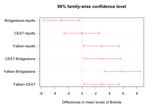
Now let’s graph just the .99 CI version.
par()$oma # current margins
## [1] 0 0 0 0
par(oma=c(0,5,0,0)) # adjust the margins because the factor names are long
plot(TukeyHSD(tyres.aov, conf.level = 0.99),las=1, col = "red")
par(oma=c(0,0,0,0)) # put the margins back
If you’re a visual learner, as I am, this helps. We’re looking at the differences in means amongst the pairs of brands. 0 on the x axis means no difference at all and the red horizontals denote 99% confidence intervals.
Finally, as I mentioned earlier there are many different ways (tests) for adjusting. Tukey HSD is very common and is easy to access and graph. But two others worth noting are the Bonferroni and it’s successor the Holm. Let’s go back to our earlier use of the pairwise.t.test. We’ll use it again (as well as the lsr wrapper function posthocPairwise). You can use the built-in R help for p.adjust to see all the methods available. I recommend holm as a general position but know your options.
pairwise.t.test(tyre$Mileage,tyre$Brands,p.adjust.method = "bonferroni")
##
##  Pairwise comparisons using t tests with pooled SD
##
## data:  tyre$Mileage and tyre$Brands
##
##             Apollo Bridgestone CEAT
## Bridgestone 0.0022 -           -
## CEAT        1.0000 0.0026      -
## Falken      0.0048 5.8e-09     0.0041
##
## P value adjustment method: bonferroni
pairwise.t.test(tyre$Mileage,tyre$Brands,p.adjust.method = "holm")
##
##  Pairwise comparisons using t tests with pooled SD
##
## data:  tyre$Mileage and tyre$Brands
##
##             Apollo Bridgestone CEAT
## Bridgestone 0.0019 -           -
## CEAT        0.9622 0.0019      -
## Falken      0.0021 5.8e-09     0.0021
##
## P value adjustment method: holm
posthocPairwiseT(tyres.aov) # default is Holm
##
##  Pairwise comparisons using t tests with pooled SD
##
## data:  Mileage and Brands
##
##             Apollo Bridgestone CEAT
## Bridgestone 0.0019 -           -
## CEAT        0.9622 0.0019      -
## Falken      0.0021 5.8e-09     0.0021
##
## P value adjustment method: holm
Happily, given our data, we get the same overall answer with very slightly different numbers. As it turns out we have very strong effect sizes and the tests don’t change our overall answers. Wait what’s an effect size you ask? That’s our next question which we will cover in the second part.


