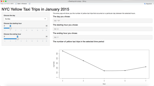
In this post, I will show you how to build this app. I will be using the dataset for yellow taxis in the month of January 2015 provided by the NYC Taxi & Limousine Commission. You will need RStudio for this. Since the dataset is very big, I created a smaller dataset that doesn’t contain as many rows. The smaller dataset can be found here.
The code I used for creating the smaller dataset is as follows:
library(dplyr)

taxiData <- read.csv('yellow_tripData.csv', stringsAsFactors = FALSE)
taxiData <- sample_frac(taxiData, 0.01)

write.csv(taxiData, file = 'taxiData.csv')
If you are confused about how sample_frac works, please refer to the dplyr tutorial.
Okay, now let’s get down to building the Shiny app. To build a shiny app, you will need two files:
- ui.R
- server.R
As the names suggest, the ui.R file is used to specify the layout of the app, and the server.R is used to specify the instructions required by your computer to build the app.
To start off, create a folder and place the ui.R, server.R, and the dataset inside it. Make sure you set it as your working directory.
Writing the ui.R file
Now, we will write the code for the ui.R file. In the code, I will make use of three panels:
- Header Panel – at the top, used for the title
- Sidebar Panel – at the left, used for the inputs
- Main Panel – at the right, used for output
The code is as follows:
shinyUI(pageWithSidebar(
  headerPanel('NYC Yellow Taxi Trips in January 2015'),
  sidebarPanel(
    selectInput('day', 'Choose the day', choices = c('Sunday' = 1, 'Monday' = 2, 'Tuesday' = 3, 'Wednesday' = 4, 'Thursday' = 5, 'Friday' = 6, 'Saturday' = 7)),
    sliderInput('startHour', 'Choose the starting hour', min = 0, max = 23, value = 3),
    sliderInput('endHour', 'Choose the ending hour', min = 0, max = 23, value = 7)
  ),
  mainPanel(
    p('This shiny app will show you the number of yellow taxi trips that occurred on a particular day between the selected hours.'),
    h4('The day you chose:'),
    verbatimTextOutput('day'),
    h4('The starting hour you chose:'),
    verbatimTextOutput('startHour'),
    h4('The ending hour you chose:'),
    verbatimTextOutput('endHour'),
    h4('The number of yellow taxi trips in the selected time period'),
    plotOutput('taxiPlot')
  )
))
First, we set the title. Then, we set three input fields in the sidebar panel. The first one is a dropdown menu with the listed choices, and the other two are sliders. Make sure you don’t forget about the commas at the end of each line.
Then, we program the main panel. p and h4 are HTML tags. p stands for paragraph, and h4 stands for heading level 4. For more info, refer here. verbatimTextOutput and plotOutput are used to display the outputs.
Writing the server.R file
Now for the server.R file.
We will need three libraries, dplyr for data manipulation, lubridate for dealing with dates, and BH which is required by Shiny to publish the app to the web. Let’s load the data:
library(dplyr)
library(lubridate)
library(BH)
taxiData <- read.csv('tripData.csv', stringsAsFactors = FALSE)
Converting to date class
We are interested in the tpep_pickup_datetime column. If you check the class of the column using class(taxiData$tpep_pickup_datetime), you will notice that it is of character class. We first need to convert it to R’s date format (POSIXct). This can be done using the ymd_hms function from the lubridate package as follows:
taxiData$tpep_pickup_datetime <- ymd_hms(taxiData$tpep_pickup_datetime)
Now if you check it’s class, you will notice that it is of the correct class. Then we will add a column to the dataset called Day, which will contain the weekday in which the pickup happened. We can access the day of the week from the date as follows:
taxiData$Day <- wday(taxiData$tpep_pickup_datetime)
Writing a function to generate the plot
Now, we will write the function to generate the plot.
tripsPlot <- function(day, startHour, endHour) {
  tripsData <- subset(taxiData, Day == day)
  tripsTable <- table(hour(tripsData$tpep_pickup_datetime))
  tripsTable <- as.table(tripsTable[(startHour + 1):(endHour + 1)])
  taxiPlot <- plot(tripsTable, type = 'o', xlab = 'Hour', xlim = c(startHour, endHour))
  return(taxiPlot)
}
First, we subset the taxiData set to contain only the datapoints for the selected day. Then, we will build a table. The table function will display how many observations there are for each hour of the day. If you look at tripsTable, it will look like this:
0    1    2    3    4    5    6    7    8    9   10   11   12   13   14   15   16   17   18   19
1059  911  714  555  351  139  144  223  336  486  704  820  901  974  909  849  833  825  832  759
  20   21   22   23
 691  638  602  509
This means that 1059 pickups happened between midnight and 1am, 911 between 1am and 2am, and so on. Next, we select only the part of the table that was selected by the user. We need to convert it back to table using as.table because tripsTable[(startHour + 1):(endHour + 1)] returns an array instead of a table and can cause errors later (as explained here).
Then we finally build the plot.
Now, for the last part of the code. This is the part that contains the actual instructions for the shiny server.
shinyServer(
  function(input, output) {
    output$day <- renderPrint({input$day})
    output$startHour <- renderPrint({input$startHour})
    output$endHour <- renderPrint({input$endHour})
    output$taxiPlot <- renderPlot({tripsPlot(input$day, input$startHour, input$endHour)})
  }
)
Here, we specify which variables need to be printed. renderPrint is used to display all the text output and renderPlot is used to display all the plot output.
Once you’re done, you will see a Run App button on the top right hand side of the editor window. If you click that, you can view the app running on your computer.
It should look like this:

If you want to publish it to the web, select Publish on the top right hand side of the window, and follow the instructions. Your app should be up and running very soon!
The Github repo can be found here.
As always, if you have questions, leave a comment or feel free to reach out to me on Twitter.