Introduction
The Problem: I've got a couple of problems with the commonly used “pairs” plot in R for quality control in -omics data. (1) It's not that space-efficient since it only uses half the space for datapoints and (2) the scatterplot isn't very informative. When I look at those scatter plots it's hard to tell anything about the spread of the data or any normalization problems. This is particularily true for proteomics data where the high dynamic range can obscure lower abundance points.
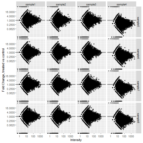
The Solution: A panel of MA plots (Minus-Average). The MA plot shows fold-change vs average intensity for a pair of samples. It lets you see difference between sample groups as fold-change which I think is a useful unit for comparison and visualizes normalization problems. Rather than plot each against each we will only compare samples between groups to save space.
This goes along with a previous post of mine that attempts to convince biologists of the value of putting tables of data into tidy format. This method takes advantage of pivoting data to succintly generate a panel of MA plots
suppressPackageStartupMessages(library(tidyverse))
library(GGally)
library(DEFormats)
Set up the data
I'll start with simulated data that will resemble a gene expression study. A proteomics dataset would be similar. The dataset will have 8 samples, half of them treated, half control. 7 of the samples will approximately the same but Sample 4 will have a 3-fold increase compared to the rest to illustrate how MA-plots help identify problems with normalization.
counts <- simulateRnaSeqData(n = 5000, m = 8)
counts[, 4] <- counts[, 4] *  3

targets <- data.frame(sample = colnames(counts), group = c(rep("control", 4), rep("treated", 4)))
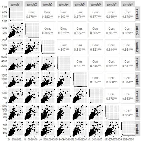
The ggpairs function from the GGally package does a decent job of the pairs plot.
ggpairs(data.frame(counts))
The pairs plot tells us something about the data. The correlation is nice to have and if any sample was wildly different from the others it would show up in the scatter plot. Still I don't think it conveys the information very efficiently.
MA plot panel
Typically I would start by pivoting all the count data to a single columns and joining in the metadata. But I need to associate control and treated data for each gene for each sample so the usual method won't work. It took me a while to fall on the solution: we have to pivot the control and treated samples separately. So for each gene we will have a control sample name, a treated sample name and control and treated count data. Those can be used to calculate Fold-change and intensity.
control_samples <- targets$sample[targets$group == "control"]
treated_samples <- targets$sample[targets$group == "treated"]

data.frame(counts) %>%
  rownames_to_column("gene") %>%
  pivot_longer(all_of(control_samples), names_to = "control_sample", values_to = "control_count") %>%
  pivot_longer(all_of(treated_samples), names_to = "treated_sample", values_to = "treated_count") %>%
  mutate(FC = treated_count / control_count) %>%
  mutate(Intensity = (treated_count + control_count) / 2)
## # A tibble: 80,000 x 7
##    gene  control_sample control_count treated_sample treated_count    FC Intensity
##    <chr> <chr>                  <dbl> <chr>                  <dbl> <dbl>     <dbl>
##  1 gene1 sample1                  103 sample5                   71 0.689      87
##  2 gene1 sample1                  103 sample6                   79 0.767      91
##  3 gene1 sample1                  103 sample7                   76 0.738      89.5
##  4 gene1 sample1                  103 sample8                  118 1.15      110.
##  5 gene1 sample2                   82 sample5                   71 0.866      76.5
##  6 gene1 sample2                   82 sample6                   79 0.963      80.5
##  7 gene1 sample2                   82 sample7                   76 0.927      79
##  8 gene1 sample2                   82 sample8                  118 1.44      100
##  9 gene1 sample3                   89 sample5                   71 0.798      80
## 10 gene1 sample3                   89 sample6                   79 0.888      84
## # ... with 79,990 more rows
All that's left to do now is plot. Facet_grid will let us split the samples up.
data.frame(counts) %>%
  rownames_to_column("gene") %>%
  pivot_longer(all_of(control_samples), names_to = "control_sample", values_to = "control_count") %>%
  pivot_longer(all_of(treated_samples), names_to = "treated_sample", values_to = "treated_count") %>%
  mutate(FC = treated_count / control_count) %>%
  mutate(Intensity = (treated_count + control_count) / 2) %>%
  ggplot(aes(x = Intensity, y = FC)) +
  geom_point(alpha = 0.5, na.rm = TRUE) +
  scale_x_continuous(trans = "log10") +
  scale_y_continuous(trans = "log2", breaks = 2^seq(-4, 4, 2)) +
  geom_hline(yintercept = 1) +
  labs(x = "Intensity", y = "Fold Change, treated vs control") +
  facet_grid(rows = vars(treated_sample), cols = vars(control_sample))
The change in abundance in sample 4 shows up much more clearly now. This isn't a common way to plot the data so it might require some explaining to your colleagues but worth the effort in my opinion.

