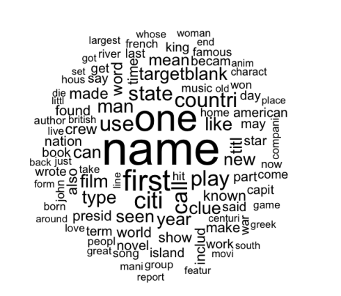
In this article, I will show you how to use text data to build word clouds in R. We will use a dataset containing around 200k Jeopardy questions. The dataset can be downloaded here (thanks to reddit user trexmatt for providing the dataset).
We will require three packages for this: tm, SnowballC, and wordcloud.
First, let’s load the required libraries and read in the data.
library(tm)
library(SnowballC)
library(wordcloud)

jeopQ <- read.csv('JEOPARDY_CSV.csv', stringsAsFactors = FALSE)
The actual questions are available in the Question column.
Now, we will perform a series of operations on the text data to simplify it.
First, we need to create a corpus.
jeopCorpus <- Corpus(VectorSource(jeopQ$Question))
Next, we will convert the corpus to a lowercase.
jeopCorpus <- tm_map(jeopCorpus, content_transformer(tolower))
Then, we will remove all punctuation and stopwords, and convert it to a plain text document.. Stopwords are commonly used words in the English language such as I, me, my, etc. You can see the full list of stopwords using stopwords('english').
jeopCorpus <- tm_map(jeopCorpus, removePunctuation)
jeopCorpus <- tm_map(jeopCorpus, PlainTextDocument)
jeopCorpus <- tm_map(jeopCorpus, removeWords, stopwords('english'))
Next, we will perform stemming. This means that all the words are converted to their stem (Ex: learning -> learn, walked -> walk, etc.). This will ensure that different forms of the word are converted to the same form and plotted only once in the wordcloud.
jeopCorpus <- tm_map(jeopCorpus, stemDocument)
Now, we will plot the wordcloud.
wordcloud(jeopCorpus, max.words = 100, random.order = FALSE)
This will produce the following wordcloud:

There are a few ways to customize it.
- scale: This is used to indicate the range of sizes of the words.
- max.words and min.freq: These parameters are used to limit the number of words plotted. max.words will plot the specified number of words and discard least frequent terms, whereas, min.freq will discard all terms whose frequency is below the specified value.
- random.order: By setting this to FALSE, we make it so that the words with the highest frequency are plotted first. If we don’t set this, it will plot the words in a random order, and the highest frequency words may not necessarily appear in the center.
- rot.per: This value determines the fraction of words that are plotted vertically.
- colors: The default value is black. If you want to use different colors based on frequency, you can specify a vector of colors, or use one of the pre-defined color palettes. You can find a list here.
That brings us to the end of this article. I hope you enjoyed it! As always, if you have questions, feel free to leave a comment or reach out to me on Twitter.
Edit: After struggling a lot, I resorted to StackOverflow for a fix. I forgot to convert the document to lower case. As explained in the StackOverflow thread, a lot of the words start with “The”, with an uppercase “T”, whereas stopwords has “the” with a lowercase “t”. This is what was causing the words “the” and “this” to appear in the wordcloud.
Note: I learnt this technique in The Analytics Edge course offered by MIT on edX. It is a great course and I highly recommend that you take it if you are interested in Data Science!