Suppose as a business manager you have the responsibility for testing and comparing the lifetimes of four brands (Apollo, Bridgestone, CEAT and Falken) of automobile tyres. The lifetime of these sample observations are measured in mileage run in ’000 miles. For each brand of automobile tyre, sample of 15 observations have been collected. On the basis of these information, you have to take you decision regarding the four brands of automobile tyre. The data is provided in the csv file format (called, tyre.csv).
In order to test and compare the lifetimes of four brands of tyre, you should apply one-way ANOVA method as there is only one factor or criterion (mileage run) to classify the sample observations. The null and alternative hypothesis to be used is given as:

Data Import and Outlier Checking
Let us first import the data into R and save it as object ‘tyre’. The R codes to do this:
tyre<- read.csv(file.choose(),header = TRUE, sep = ",")
attach(tyre)
Before doing anything, you should check the variable type as in ANOVA, you need categorical independent variable (here the factor or treatment variable ‘brand’. In R, you can use the following code:
is.factor(Brands)
[1] TRUE
As the result is ‘TRUE’, it signifies that the variable ‘Brands’ is a categorical variable.
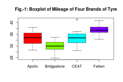
Now it is all set to run the ANOVA model in R. Like other linear model, in ANOVA also you should check the presence of outliers can be checked by boxplot. As there are four populations to study, you should use separate boxplot for each of the population. In R, it is done as:
boxplot(Mileage~Brands, main="Fig.-1: Boxplot of Mileage of Four Brands of Tyre", col= rainbow(4))
If you are using advanced graphics, you can use the ‘ggplot2’ package with the following code to get the above boxplot.
library(ggplot2)
ggplot(tyre, aes(Brands,Mileage))+geom_boxplot(aes(col=Brands))+labs(title="Boxplot of Mileage of Four Brands of Tyre")
The above picture shows that there is one extreme observation in the CEAT brand. To find out the exact outliers or extreme observations, you can use the following command:
boxplot.stats(Mileage[Brands=="CEAT"])
$stats
[1] 30.42748 33.11079 34.78336 36.12533 36.97277

$n
[1] 15

$conf
[1] 33.55356 36.01316

$out
[1] 41.05
So, the outlier is the observation valued ‘41.05’. The confidence interval is (33.55 – 36.01) and the minimum and maximum values of the sample coming from the population ‘CEAT’ is 30.43 and 41.05 respectively. Considering all these points, we ignore the outlier value ‘41.05’ momentarily and carry out the analysis. If at later stage, we find that this outlier may create problems in the estimation, we will exclude it.
Estimation of Model
Let us now fit the model by using the aov() function in R.
model1<- aov(Mileage~Brands)
To get the result of the one-way ANOVA:
summary(model1)
 Df Sum Sq Mean Sq F value   Pr(>F)
Brands       3  256.3   85.43   17.94 2.78e-08 ***
Residuals   56  266.6    4.76
---
Signif. codes:  0 ‘***’ 0.001 ‘**’ 0.01 ‘*’ 0.05 ‘.’ 0.1 ‘ ’ 1
From the above results, it is observed that the F-statistic value is 17.94 and it is highly significant as the corresponding p-value is much less than the level of significance (1% or 0.01). Thus, it is wise to reject the null hypothesis of equal mean value of mileage run across all the tyre brands. In other words, the average mileage of the four tyre brands are not equal.
Now you have to find out the pair of brands which differ. For this you may use the Tukey’s HSD test. In R, the following are the code for applying the Tukey’s HSD test:
TukeyHSD(model1, conf.level = 0.99)
Tukey multiple comparisons of means
    99% family-wise confidence level

Fit: aov(formula = Mileage ~ Brands)

$Brands
                          diff        lwr        upr     p adj
Bridgestone-Apollo -3.01900000 -5.6155816 -0.4224184 0.0020527
CEAT-Apollo        -0.03792661 -2.6345082  2.5586550 0.9999608
Falken-Apollo       2.82553333  0.2289517  5.4221149 0.0043198
CEAT-Bridgestone    2.98107339  0.3844918  5.5776550 0.0023806
Falken-Bridgestone  5.84453333  3.2479517  8.4411149 0.0000000
Falken-CEAT         2.86345994  0.2668783  5.4600415 0.0037424
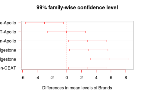
The TukeyHSD command shows the pair-wise difference of mileage of four brands of tyres at 1% level of significance. Here, the “diff” column provides mean differences. The “lwr” and “upr” columns provide lower and upper 99% confidence bounds, respectively. Finally, the “p adj” column provides the p-values adjusted for the number of comparisons made. As there are four brands, six possible pair-wise comparisons are obtained. The results show that all the pairs of mileage are statistically significantly different from the Tukey’s Honestly Significant Differences, except for the pair CEAT-Apollo. More specifically, the pair-wise difference between Bridgestone-Apollo is found to be -3.019 which means that Apollo has higher mileage than Bridgestone and this is statistically significant. Similarly, you can make other pair-wise comparison.
You can also plot these the results of Tukey’s HSD comparison by using the plot function as follows:
plot(TukeyHSD(model1, conf.level = 0.99),las=1, col = "red")
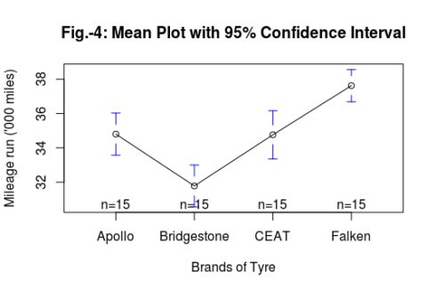
Another way of visualization by plotting means of mileage of four brands of tyre with the help of gplots package. By using the plotmeans() function in the gplots package, you can create the mean plots for single factors including confidence intervals.
library(gplots)
plotmeans(Mileage~Brands, main="Fig.-3: Mean Plot with 95% Confidence Interval", ylab = "Mileage run ('000 miles)", xlab = "Brands of Tyre")
Diagnostic Checking
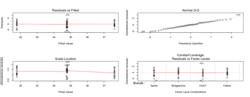
Diagnostic Checking: After estimating the ANOVA model and finding out the possible pairs of differences, it is now time to go for the different diagnostic checking with respect to model assumptions. The single call to plot function generates four diagnostic plots (Fig.-5).
par(mfrow=c(2,2))
plot(model1)
The Residuals vs. Fitted plot shown in the upper left of Fig.-4, shows the fitted values plotted against the model residuals. If the residuals follow any particular pattern, such as a diagonal line, there may be other predictors not yet in the model that could improve it. The flat lowess line looks very good as the single predictor variable or regressor sufficiently explaining the dependent variable.
The Normal Q-Q Plot in the upper right of Fig.-4, shows the quantiles of the standardized residuals plotted against the quantiles you would expect if the data were normally distributed. Since these fall mostly on the straight line, the assumption of normally distributed residuals is met. Since there are only 15 observations in each individual brand of tyre, it is not wise to go for group-wise checking of normality assumption. Moreover, the normality of the overall residual can be checked by means of some statistical test such as Shapiro-Wilk test. Shortly I’ll show you this procedure too.
The Scale-Location plot in the lower left of Fig.-4, shows the square root of the absolute standardized residuals plotted against the fitted, or predicted, values. Since the lowess line that fits this is fairly flat, it indicates that the spread in the predictions is almost the same across the prediction line, indicating the very less chances of failure of meeting the assumption of homoscedasticity. This will be further verified by some statistical tests. In case of ANOVA, you can check the assumption of homogeneity of variances across the four brands of tyre.
Finally, the Residuals vs. Leverage plot in the lower right corner, shows a measure of the influence of each point on the overall equation against the standardized residuals. Since no points stand out far from the pack, we can assume that there are no outliers having undue influence on the fit of the model.
Thus, the graphical diagnostic of the model fit apparently shows that the assumptions requirements of ANOVA model is fairly fulfilled. However, the normality assumption and homogeneity are supposed to be confirmed by the appropriate statistical tests.
Regarding the fulfillment of normality assumption, it has been already discussed that when the number of observations is less, it is wise to test normality for the overall residuals of the model, instead of checking it for separate group. In R the residuals of model is saved as follows:
uhat<-resid(model1)
where resid function extracts the model residual and it is saved as object ‘uhat’.
Now you may apply the Shapiro-Wilk test for normality with the following hypotheses set-up:

The test code and results are shown below:
shapiro.test(uhat)
Shapiro-Wilk normality test
data:  uhat
W = 0.9872, p-value = 0.7826
As the p-value is higher than the level of significance, you cannot reject the null hypothesis, which implies that the samples are taken from the normal populations.
Another assumption requirement is the homogeneity of variances across the groups, which can be statistically tested by Bartlett test and Levene test. In both the test, the null hypothesis is set as the homogeneity of variance across the cross-sectional group. The tests are conducted as follows:
bartlett.test(Mileage~Brands)
Bartlett test of homogeneity of variances
data:  Mileage by Brands
Bartlett's K-squared = 2.1496, df = 3, p-value = 0.5419
library(car)
levene.test(Mileage~Brands)
Levene's Test for Homogeneity of Variance (center = median)
      Df F value Pr(>F)
group  3  0.6946 0.5592
      56
Both the tests confirmed the presence of homogeneity of variance across the four brands of tyre as we cannot reject the null hypothesis of homogeneity of variances across the brands of tyre.
The Conclusion
The mileages of the four brands of tyre are different. The results show that all the pairs of mileage are statistically significantly different from the Tukey’s Honestly Significant Differences, except for the pair CEAT-Apollo. More specifically, the pair-wise difference between Bridgestone-Apollo is found to be -3.019 which means that Apollo has higher mileage than Bridgestone and this is statistically significant.


