The main aim of this project is to study the states which had the most obese population among adults and children as well as teens in USA. Secondly, another objective of this project is to learn how to scrape data in R from an HTML page using rvest package and generate beautiful maps using ggplot and maps package in R. A similar post was published earlier at DataScience+.
Loading the Required Packages
require(rvest)
#rvest is the package to scrape Web pages in R
# ?rvest to search more on this package

require(ggplot2)
require(dplyr)
require(scales)
require(maps)
Now Scraping Data from wikipedia article and converting it to a R Data frame
#Loading the Data

obesity<-read_html("https://en.wikipedia.org/wiki/Obesity_in_the_United_States")
?read_html #for knowing more on this function

#html_nodes() to select a particular HTML element from the above page
#Converting to a R dataframe
#xpath of the Wikipedia table data
obesity = obesity %>%
  html_nodes(xpath='//*[@id="mw-content-text"]/div/table[2]') %>%
  .[[1]] %>%
  html_table(fill=T)


head(obesity)
##   State and District of Columbia Obese adults
## 1                        Alabama        30.1%
## 2                         Alaska        27.3%
## 3                        Arizona        23.3%
## 4                       Arkansas        28.1%
## 5                     California        23.1%
## 6                       Colorado        21.0%
##   Overweight (incl. obese) adults Obese children and adolescents
## 1                           65.4%                          16.7%
## 2                           64.5%                          11.1%
## 3                           59.5%                          12.2%
## 4                           64.7%                          16.4%
## 5                           59.4%                          13.2%
## 6                           55.0%                           9.9%
##   Obesity rank
## 1            3
## 2           14
## 3           40
## 4            9
## 5           41
## 6           51
Data Transformation
#to check the structure of the data
str(obesity)
## 'data.frame':    51 obs. of  5 variables:
##  $ State and District of Columbia : chr  "Alabama" "Alaska" "Arizona" "Arkansas" ...
##  $ Obese adults                   : chr  "30.1%" "27.3%" "23.3%" "28.1%" ...
##  $ Overweight (incl. obese) adults: chr  "65.4%" "64.5%" "59.5%" "64.7%" ...
##  $ Obese children and adolescents : chr  "16.7%" "11.1%" "12.2%" "16.4%" ...
##  $ Obesity rank                   : int  3 14 40 9 41 51 49 43 22 39 ...
We need to remove the ‘%’ from the data and convert it to numeric data type to draw plots using ggplot package.
#removing the % and making the data numeric

for(i in 2:4){
  obesity[,i] = gsub("%", "", obesity[,i])
  obesity[,i] = as.numeric(obesity[,i])
}

str(obesity)
## 'data.frame':    51 obs. of  5 variables:
##  $ State and District of Columbia : chr  "Alabama" "Alaska" "Arizona" "Arkansas" ...
##  $ Obese adults                   : num  30.1 27.3 23.3 28.1 23.1 21 20.8 22.1 25.9 23.3 ...
##  $ Overweight (incl. obese) adults: num  65.4 64.5 59.5 64.7 59.4 55 58.7 55 63.9 60.8 ...
##  $ Obese children and adolescents : num  16.7 11.1 12.2 16.4 13.2 9.9 12.3 14.8 22.8 14.4 ...
##  $ Obesity rank                   : int  3 14 40 9 41 51 49 43 22 39 ...
Now fixing the attributes Names to remove spaces between them.
#Fixing the names to remove spaces

names(obesity)
## [1] "State and District of Columbia"  "Obese adults"
## [3] "Overweight (incl. obese) adults" "Obese children and adolescents"
## [5] "Obesity rank"
We will use make.names to remove spaces and make syntactically valid names.
names(obesity) = make.names(names(obesity))
names(obesity)
## [1] "State.and.District.of.Columbia"  "Obese.adults"
## [3] "Overweight..incl..obese..adults" "Obese.children.and.adolescents"
## [5] "Obesity.rank"
Loading the Map data for USA and merging it with Obesity Data frame
maps package in R provides methods to load the geographical data of different countries and the world in R to a data frame consisting of Latitudes and Longitudes as well which can further be used to generate and visualize maps in R.
#Loading the map data-----------------

states = map_data("state")
?map_data to read more on using this function

# create a new variable region for state
obesity$region = tolower(obesity$State.and.District.of.Columbia)

#merging the datasets
states = merge(states, obesity, by="region", all.x=T)
str(states)
## 'data.frame':    15537 obs. of  11 variables:
##  $ region                         : chr  "alabama" "alabama" "alabama" "alabama" ...
##  $ long                           : num  -87.5 -87.5 -87.5 -87.5 -87.6 ...
##  $ lat                            : num  30.4 30.4 30.4 30.3 30.3 ...
##  $ group                          : num  1 1 1 1 1 1 1 1 1 1 ...
##  $ order                          : int  1 2 3 4 5 6 7 8 9 10 ...
##  $ subregion                      : chr  NA NA NA NA ...
##  $ State.and.District.of.Columbia : chr  "Alabama" "Alabama" "Alabama" "Alabama" ...
##  $ Obese.adults                   : num  30.1 30.1 30.1 30.1 30.1 30.1 30.1 30.1 30.1 30.1 ...
##  $ Overweight..incl..obese..adults: num  65.4 65.4 65.4 65.4 65.4 65.4 65.4 65.4 65.4 65.4 ...
##  $ Obese.children.and.adolescents : num  16.7 16.7 16.7 16.7 16.7 16.7 16.7 16.7 16.7 16.7 ...
##  $ Obesity.rank                   : int  3 3 3 3 3 3 3 3 3 3 ...
Visualizing the Data
#a data frame for adding Names to the states on the Map- making a new data frame

statenames = states %>%
  group_by(region) %>%
  summarise(
    long = mean(range(long)),
    lat = mean(range(lat)),
    group = mean(group),
    Obese.adults = mean(Obese.adults),
    Obese.children.and.adolescents = mean(Obese.children.and.adolescents)
  )
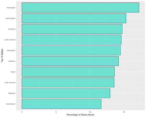
Now finding the top 10 states with most Obese Adult population using dplyr package.
#Data frame consisting of top 10 Most Obese Adults States
topstate = states %>%
  group_by(region) %>%
  summarise(

    Obese.adults = mean(Obese.adults)
   )
   %>%
  arrange(desc(Obese.adults)) %>%
  top_n(10)
Plotting the States with Most Obese Adults
Making a Barplot.
#Plotting the top 10 states

ggplot(aes(x = reorder(region,Obese.adults), y = Obese.adults),data = topstate) +
  geom_col(color="black",fill="#1EDBC2",alpha=0.6) +
  labs(y = "Percentage of Obese Adults",x="Top 10 States") +
  coord_flip()
From the Barplot we notice that the State with Highest Obese Adult Population is Mississippi.
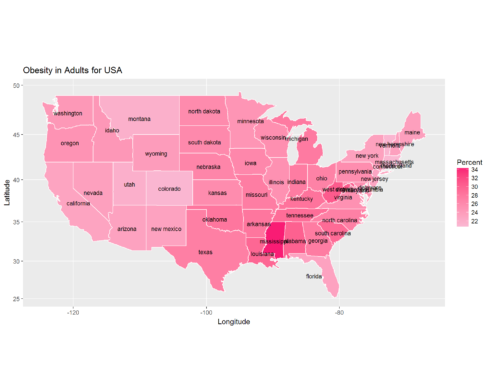
Plotting a Map for Most Obese Adult Population
#Plotting the data on a map------------------------


#For obese adults

ggplot(states, aes(x = long, y = lat, group = group, fill = Obese.adults)) +
  geom_polygon(color = "white",show.legend = T) +
  scale_fill_gradient(name = "Percent", low = "#FAB8D2", high = "#F91C74", guide = "colorbar", na.value="black", breaks = pretty_breaks(n = 5)) +
  labs(title="Obesity in Adults for USA",x = "Longitude",y = "Latitude") +
  coord_map() +
  #adding States names to the states on the map
  geom_text(data=statenames, aes(x = long, y = lat, label = region), size=3)
The darker regions on the map indicate the State with highest percentage of Obese Adult population. The state with minimum obese adult population is Connecticut.
Obesity in Children and Teen Population
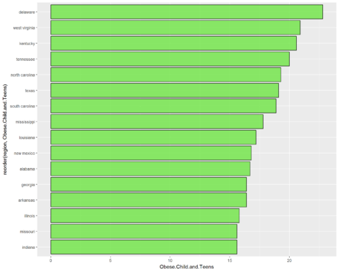
Creating an new data frame with Top 15 States with Most Obese Children and Teens Population.
#Now Analyzing the Obese Children and Teens

#Finding top 15 States with Most Obese Children and Teens
topChild = states %>%
      group_by(region) %>%
      summarise(Obese.Child.and.Teens = mean(Obese.children.and.adolescents)) %>%
      top_n(15)
Making a Barplot
#Barplot

ggplot(data = topChild, aes(x = reorder(region,Obese.Child.and.Teens), y = Obese.Child.and.Teens))+
        geom_col(color="black",fill="#6EE543",alpha=0.8) +
        coord_flip()
As we can notice the state with most Obese children and Teens is Delaware.
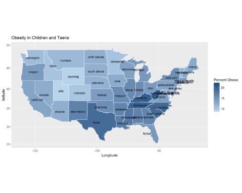
#Map for Obesity in Children

ggplot(states, aes(x = long, y = lat, group = group, fill = Obese.children.and.adolescents)) +
  geom_polygon(color = "white") +
  scale_fill_gradient(name = "Percent Obese", low = "#B8D5EC", high = "#0A4B7D", guide = "colorbar", na.value="black", breaks = pretty_breaks(n = 5)) +
  labs(title="Obesity in Children and Teens", x = "Longitude",y = "latitude") +
  coord_map() +
  #adding States names to the states on the map
  geom_text(data=statenames, aes(x = long, y = lat, label = region), size=3)
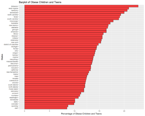
Now let’s plot a complete Barplot of States and Percentage of Obese Children and Teens
ggplot(aes(x = reorder(region,Obese.children.and.adolescents),y = Obese.children.and.adolescents),
           data = statenames) +
  geom_col(color="black",fill="#F43E3E",width=1)   +
  coord_flip() +
  labs(x = "States", y ="Percentage of Obese Children and Teens",title="Barplot of Obese Children and Teens")
The State with Highest Obese Teen and Children population is Delaware and the state with least obese teens and children is Utah.
Conclusion
In this project we firstly learned to scrape data using rvest package from wikipedia and then analyzed and visualized the States with most Obese Adult and children population.We also learned how to create beautifull maps using ggplot and maps packages in R.
Hope you guys liked the article and is interesting enough to get you started with scraping data from any web document and start analyzing it yourself in R and create beautiful maps and plots.
Make sure to like and share it.Cheers !
