Note, at the time of this writing using the packages ggplot2 and ggmap from CRAN will result in an error. To avoid the error be sure to install both packages from GitHub with the package devtools and restart R if the problem persists.
devtools::install_github("dkahle/ggmap")
devtools::install_github("hadley/ggplot2")
Introduction
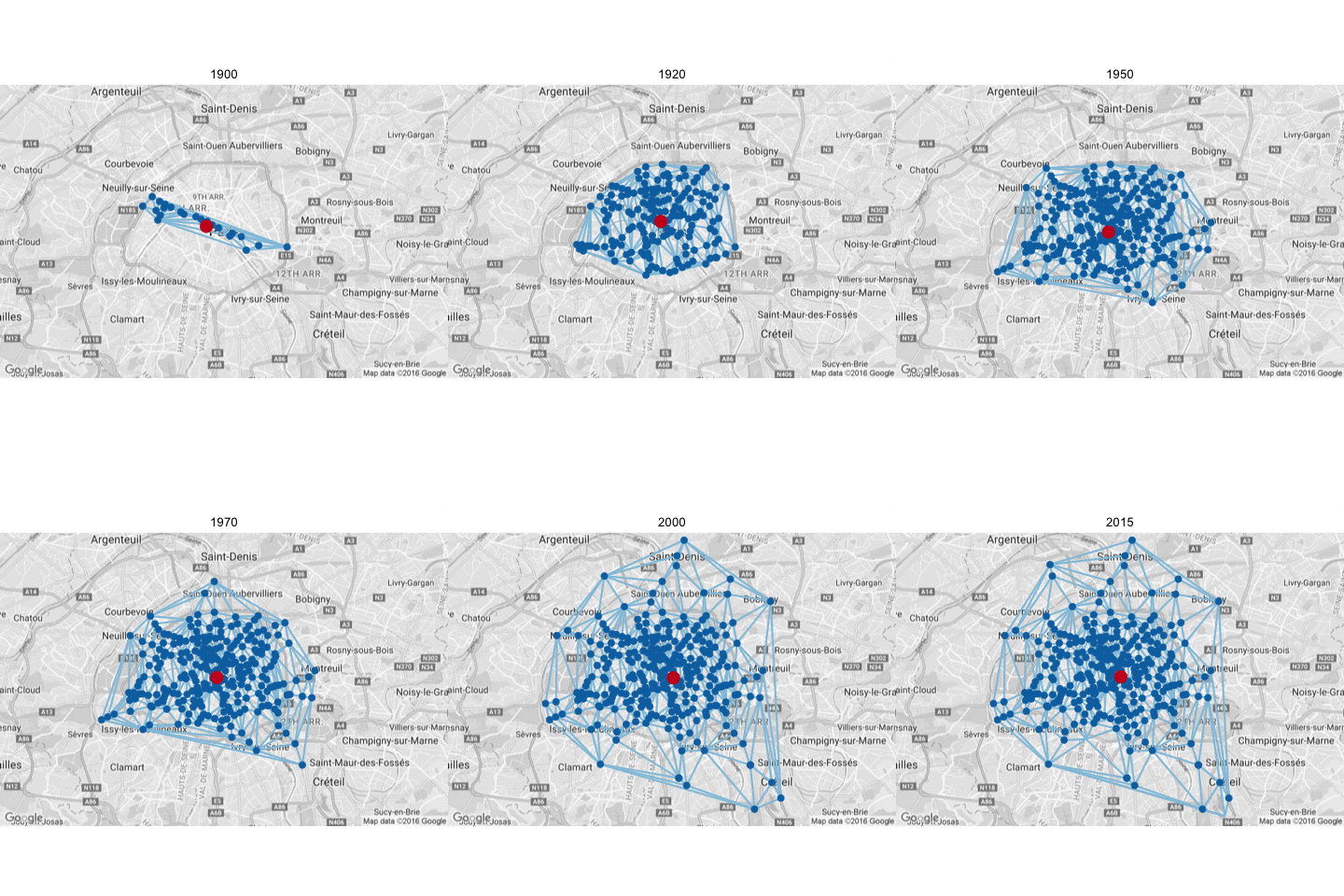
Metro systems are an interesting way to learn more about the growth of a city over time. You can see things like how the city expanded as public transit spread farther and farther from the original city limits. You can also see how the city center moved from certain neighborhoods to others. One example of this is the city of Paris, where I currently live, which started off just having metro stops along the river, and then quickly spread to a more circular shape over time. The gif below shows that progression over time. Blue dots are metro stops and the red dot is the center of the metro system.
By the end of these three post you will be able to make that gif yourself, as well as gifs for three other European cities. To do this we’ll be playing around with several R packages with the final goal of making gifs with Delaunay triangulations. Of the packages we’ll be using, several will be from the tidyverse. However, instead of loading them all in one package, we’ll load each separately so you can get a better idea for what each package can be used for. In the future though I highly recommend the single library(tidyverse) call to make your life easier.
The tutorial is cut into three posts: 1) making maps with metro stops, 2) making maps with Delaunay triangulations and centroids, and 3) making maps that change over time, where we’ll make the gif above.
Data
Today’s data is the location of metro stops in four European cities: Paris, Berlin, Barcelona, and Prague. To collect the names of stops from each city I went to the Wikipedia article for each respective city’s metro system. I also coded if the stop was actually in the city being analyzed or a different town, usually bordering the city.
With my data in place I began to work with it in R to organize it. I used three packages to start off, dplyr, tidyr (both in tidyverse), and ggmap. With ggmap you can download maps from various sources, including Google Maps, and plot them in the ggplot2 environment. I first read in my data and then create a new column called geo_location by combining the station and location columns with a unite() call. I also use the separate() call, the converse of unite() to split the opened column (which refers to the date when the stop was opened) into three columns, one for month, day and year. Now I get to use my first ggmap call, mutate_geocode(). I can feed the call my geo_location column from my data frame and it will make two new columns, lon and lat, finding the longitude and latitude of each stop, and add these values to my new columns. Note, I originally tried added the word “Station” at the end of the stop for all stops but this caused problems.
library(dplyr)
library(tidyr)
library(ggmap)

data = read.table("https://raw.githubusercontent.com/pagepiccinini/blog/master/2016-09-27_metros/data_metros.txt", header=T, sep="\t") %>%
  unite(geo_location, c(station, location), sep = ", ", remove = FALSE) %>%
  separate(opened, into = c("opened_month", "opened_day", "opened_year"), sep = "/") %>%
  mutate_geocode(geo_location, source = "google")
The output from Google Maps is not exactly the same as the Google Maps API. I tried to hand correct errors as much as possible, but I am not an expert on European Metro systems. If you see an erroneous data point from your city feel free to let me know! The final data below is thus a combination of data from the mutate_geocode call and any hand correction on my part. Below you can see some of the data we’ve created. I’ve only included the first 6 data points for the sake of space, but you can look at all of the data in the GitHub repository.
data <- read.table("https://raw.githubusercontent.com/pagepiccinini/blog/master/2016-09-27_metros/data_metro_full.txt", header=T, sep="\t")
head(data)
   city                             geo_location                 location         station line
1 Paris                  Abbesses, Paris, France            Paris, France        Abbesses   12
2 Paris                    Alésia, Paris, France            Paris, France          Alésia    4
3 Paris           Alexandre Dumas, Paris, France            Paris, France Alexandre Dumas    2
4 Paris            Alma – Marceau, Paris, France            Paris, France  Alma – Marceau    9
5 Paris Anatole France, Levallois-Perret, France Levallois-Perret, France  Anatole France    3
6 Paris                    Anvers, Paris, France            Paris, France          Anvers    2
  opened_month opened_day opened_year      lon      lat
1           10         31        1912 2.338559 48.88430
2           10         30        1909 2.327058 48.82820
3            1         31        1903 2.394419 48.85633
4            5         27        1923 2.352222 48.85661
5            9         24        1937 2.284904 48.89223
6           10          7        1902 2.344253 48.88285
Maps with Metro Stops
With our data in place we can start making our maps. This brings us to our second ggmap call, get_googlemap(). With this call I can download city specific maps for my four cities by setting center to each of my cities. I can also set the type of map (terrain, satellite, roadmap, hybrid), how close to zoom in (integers that range from continent to building), the size of my map in pixels, and if I want the map in black and white or color.
paris_map = get_googlemap(center = "Paris", maptype = "roadmap",
                          zoom = 11, size = c(640, 420), color = "bw")

berlin_map = get_googlemap(center = "Berlin", maptype = "roadmap",
                           zoom = 10, size = c(640, 420), color = "bw")

barcelona_map = get_googlemap(center = "Barcelona", maptype = "roadmap",
                              zoom = 11, size = c(640, 420), color = "bw")

prague_map = get_googlemap(center = "Prague", maptype = "roadmap",
                           zoom = 11, size = c(640, 420), color = "bw")
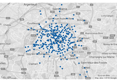
With our map objects saved from Google we can now plot our maps and our metro stops on top. Since I’ll be making roughly the same plot each time I wrote a function which you can see below. The main difference from a typical ggplot2 plot is instead of using ggplot() to start off the plot you use ggmap() and then feed it the map we had saved. The setting extent = "device" is used to suppress the x and y axes with their tick marks. From then on it takes the same ggplot2 calls as any other plot. For example, we can use geom_point() to plot our metro stops. See the maps with metro stops for the four cities below. I’ve included the code for the Paris map for example, but hidden the rest since it is basically the same.
city_plot = function(city_name, city_map){
  ggmap(city_map, extent = "device") +
    geom_point(data = subset(data, city == city_name), aes(x = lon, y = lat),
               color = "#0571b0", size = 3)
}

paris.plot = city_plot("Paris", paris_map)
paris.plot
Conclusion
In this post we pulled down geolocation information from Google for metro stops in four cities. We then plotted those stops on top of maps of the cities. In the next post we’ll investigate the relative sizes of these metro networks and where the “center” of the city is according to its metro system.

