In this post I will try to explain how to perform a factor analysis (FA) on the statistics of the teams in the first round of Euro cup 2016. Meanwhile, I assume that you have enough background on the theory of FA and so I will just stick with the application of this technique.
Wikipedia defines the factor analysis as “A statistical method used to describe variability among observed, correlated variables in terms of a potentially lower number of unobserved variables called factors.” So according to this definition I can say, I will try to define some new latent variables that would compress all our information into one or two factors (I call them here as a score) and help to make better predictions for the next round.
So here is the dataset I obtained from the EUFA website. You can download the dataset here.
Load the data and packages
library(ggplot2)
library(dplyr)
library(corrplot)
library(psych)
library(MASS)

dataset<-read.csv("Dataset_16.csv")
dataset$Standing<-as.factor(dataset$Standing)
d_stan = as.matrix(scale(dataset[,3:25]))
All I do is just, first, I scale my variables (because they have different units) and then simply using psych package, I perform a FA with 3 factors and ‘quartimax' rotation (one of the main advantages of FA over PCA is the fact that you can rotate your factors and make the weightings of some variables zero or close to zero in order to create more meaningful factors). It turns out that the third factor is basically containing the same information as the second factor and it doesn't explain as much extra variability as it is supposed to. Therefore, I just repeat the same FA with two factors and compute the scores using 'factor.scores' function.
# Factor Analysis
FA<-fac(cor(d_stan),2, rotate = "promax", fm = "minres")
scor<-factor.scores((dataset[,3:25]), FA)
FA.dat<-dataset%>%mutate(score1=scor$scores[,1],score2=scor$scores[,2])
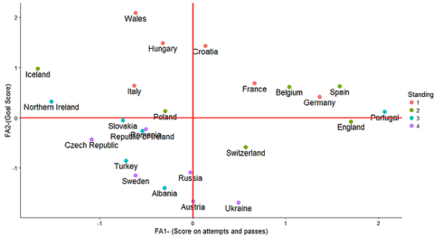
Interestingly, by plotting the scores found from the first and the second factor we can find a meaningful pattern. Almost all the teams which they were knocked out in the group stage are all located in the SW part of the plot.
FA.dat%>%ggplot(aes(x=score1,y=score2))+
  theme_classic(base_size = 15)+
  geom_point(aes(color=Standing),size=4)+
  geom_text(aes(label = Team,y=score2-0.1),size=6)+
  labs(x="FA1- (Score on attempts and passes)",y="FA2-(Goal Score)")+
  geom_vline(xintercept = 0,color="red",size=1.2)+
  geom_hline(yintercept = 0,color="red",size=1.2)
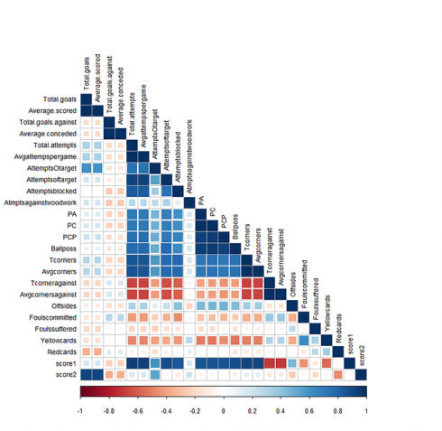
In the next step I ploted the correlation between the scores (score1 and score2) found from the first two factors and the rest of the variables. It shows that the first score is highly correlated with the variables that shows the ability of the teams on making the opportunities and dominating the game. While, the second score is highly correlated with the ability of the teams on goal score. Therefor, each point in the above plot is representing a team and basically the farther right means the higher ability to dominating the game and so on.
corrplot(cor(FA.dat[,3:ncol(FA.dat)]), mar = c(1,0, 0, 0),tl.cex=0.9,method="square",type="lower", tl.col = "black")
Even though this simple analysis is not enough to answer all the questions you have, but this should give you a really good idea of who should for example win the Wales VS Northern Ireland game.
On my Github you can find the data and R code.
Post a comment below if you have any suggestion or comment.

