In this post I will give a brief introduction to time series analysis and its applications. We will be using the R package astsa which was developed by professor David Stoffer at the University of Pittsburgh. The textbook it accompanies, which is a good read for anyone interested in the topic, can be found in a free eBook format here: Time Series Analysis and Its Applications
Time series are a series of observations made over a certain time interval. It is commonly used in economic forecasting as well as analyzing climate data over large periods of time. The main idea behind time series analysis is to use a certain number of previous observations to predict future observations.
First we install and load the astsa package.
install.packages("astsa")
require(astsa)
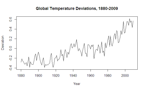
We will be examining the data set gtemp, which contains global temperature deviations from the 1951-1980 average, measured from 1880-2009.
plot(gtemp, xlab="Year", ylab="Deviation", main="Global Temperature Deviations, 1880-2009")
Before we build a model, we want to check that the time series is stationary. To be stationary a time series requires three things:
- Constant mean across all t.
- Constant variance across all t.
- Autocovariance between two observations is only dependent on distance between the observations, which we will refer to as the lag h.
Real data usually doesn’t usually meet these standards unless we are measuring something such as white noise. Judging with our eyes, the time series for gtemp appears non-stationary. The mean is non-constant and there is clearly an upward trend. The variance appears to be pretty consistent however.
We can further check this through the acf2() function. If stationary, the ACF/PACF plots will show a quick drop-off in correlation after a small amount of lag between points.
acf2(gtemp)
The dotted blue line details significance threshold for each lag. Clearly this data is non-stationary as a high number of previous observations are correlated with future values. Although regression techniques would allow one to fit a smooth curve to this data, time series analysis is interested in removing as much trend as possible in order to identify potential factors that a regression line wouldn’t capture.
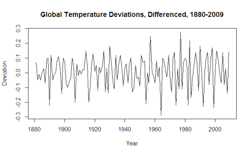
We will now transform the series in to stationary by subtracting Xt-1 from Xt for all values t. This technique is called differencing and can be done with the diff function.
plot(diff(gtemp)
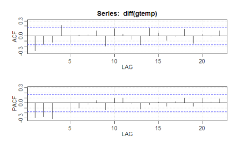
acf2(diff(gtemp))
That seems to have done the trick, with all significant correlation being removed after lag 1. It’s time to fit a time series model to the data using the sarima function. The sarima function takes in 3 parameters (p,d,q), which correspond to the Auto-Regressive order, degree of differencing, and Moving-Average order. If you are not familiar with those terms, I recommend a quick overview here: Auto-regressive-moving-average model
The ACF/PACF plot give us suggestions on what degree of parameters to utilize. If the ACF had a smooth, geometric decay and the PACF a cutoff at lag p, we would utilize a pure AR(p) model. Given that the ACF shows no pattern of a smooth decay and decays to insignificance after lag 1, we will build an MA(1) model to fit the data. We will choose d = 1 as our degree of differencing, evidenced by our earlier call of the diff function.
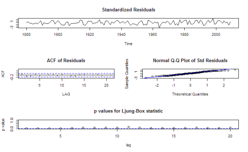
sarima(gtemp,0,1,1)
Coefficients:
          ma1  constant
      -0.6550    0.0063
s.e.   0.0795    0.0030
sigma^2 estimated as 0.009574:  log likelihood = 116.11,  aic = -226.22
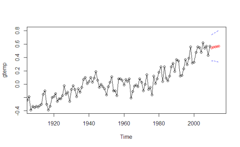
As we can see from our model, it is a good fit. The residuals fluctuate around 0, and the QQ-plot captures the distribution well besides some length at the extreme tails. We will now forecast our ARIMA model five years in to 2014. The blue lines indicate the standard error of our model.
sarima.for(gtemp,5,0,1,1)
The model forecast fits the data well.
Given a stationary transformation that neutralizes trends such as the one in our original gtemp data, researchers can identify previously unnoticed components to strengthen their forecasting.
