I am way more experienced with R than with Python and prefer to code in this language when possible. This applies, especially when it is about visualizations. Plotly and ggplot2 are fantastic packages that provide a lot of flexibility. However, every language has its limitations, and the best results stem from their efficient combination.
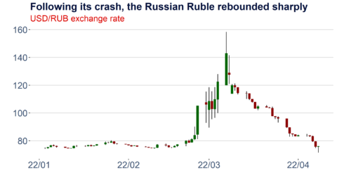
This week, I created the candlestick below, and I think it’s an excellent case study to illustrate a few things:
The Python part
Let’s start with the Python code required. First, we need to install the investpy package using pip to run the simple function below. Investpy is a fantastic and very powerful wrapper around the public API of the investing.com page. It allows the retrieval of end of day price data for a wide range of financial instruments, including stocks, bonds, ETFs, mutual funds, indices, currencies, commodities and cryptocurrencies, as well as the download of selected meta-data. Detailed documentation can be found here or in pdf format under this link. Save the function defined below in a python script.
#pip install investpy

def get_fx_cross_investpy(currency_cross,st_date,ed_date):
    import investpy
    data = investpy.get_currency_cross_historical_data(currency_cross=currency_cross, from_date=st_date, to_date=ed_date)
    return(data)
The R part
To use the previously defined Python function in R and to subsequently plot the data, we require the following four packages that can be installed easily from CRAN.
install.packages("reticulate")
install.packages("ggplot2")
install.packages("ggthemes")
install.packages("scales")
Defining a pretty theme
The ggthemes package comes with a few nice default themes for ggplot2 graphics. So you can, for instance, replicate the famous design of the Economist or the appearance of typical Stata charts. However, it is also possible to adapt these themes and create your unique default layout. I demonstrate this below for my standard formatting. The function defined here is later used in the candlestick function.
theme_aq_black_default_font<-
  function (base_size = 12, base_family = "")
  {
    library(ggplot2)
    library(ggthemes)
    library(scales)
    col_aq2<-as.character(c("#04103b","#dd0400","#3b5171","#5777a7","#969696","#BDBDBD","#D9D9D9","#F0F0F0"))

    theme_hc(base_size = base_size, base_family = base_family) %+replace%
The candlestick function
Candlesticks are widely used in the visualization of price data and technical analysis. It allows viewers to quickly gauge the significance of market moves and analyze potential resistance levels or extraordinary price jumps that may be reverted in the future. To construct the daily candlestick displayed above, we require daily opening and closing prices as well as intraday highs and lows. Fortunately, this is all available on investing.com and can be retrieved as a handy data frame with our function defined above.
ggplot_candlestick<-function(df,width=0.9,chart_title,chart_subtitle)
{
	library(ggplot2)
  df$Date<-row.names(df)
  df$Date<-as.Date(df$Date,"%Y-%m-%d")
  df$chg  df$Open, "dn", "up")
  cols<-as.character(c("#04103b","#dd0400","#3b5171","#5777a7","#969696","#BDBDBD","#D9D9D9","#F0F0F0"))

  p<-
    ggplot(data=df,aes(x=as.Date(Date), y=High))+
    geom_linerange(aes(ymin=Low, ymax=High)) +
    geom_rect(aes(xmin = Date - width/2 * 0.9, xmax = Date + width/2 * 0.9, ymin = pmin(Open, Close), ymax = pmax(Open, Close), fill = df$chg)) +
    scale_fill_manual(values = c("up" = "darkred", "dn" = "darkgreen"))+
    scale_colour_manual(values = cols)+
    theme_aq_black_default_font(base_size=18)+
    labs(color='')+
    labs(title=chart_title,subtitle=chart_subtitle,x ="")+
    labs(caption = paste0('Source: DataScience+, Investing.com  ', Sys.Date()))+
    guides(colour = guide_legend(nrow = 1))+
    scale_x_date(labels = date_format("%y/%m"))+
    theme(legend.position = "none",legend.margin=margin(-20,-20,-20,-20),legend.box.margin=margin(0,0,30,0))+
    ylab("")+
    theme(plot.margin=margin(l=5,r=20,b=5,t=5))

  return(p)
}
Plot the data and export the graphic
Last but not least, let’s combine all these modules and execute them step by step. Once we have loaded our Python function employing the reticulate package, we can use it in R to retrieve the financial data from investpy. We can subsequently use our previously defined R functions to create the candlestick plot. The plot can then be exported easily as a PNG or SVG graphic utilizing ggsave.
# Load the python function and retrieve the financial data
library(reticulate)
source_python("C:/Users/Fabian/Desktop/get_rates_investing.com.py")
df<-get_fx_cross_investpy("USD/RUB",'01/01/2022','01/05/2022')

# Use the R functions and plot the data
p<-ggplot_candlestick(df,chart_title="Following its crash, the Russian Ruble rebounded sharply",chart_subtitle="USD/RUB exchange rate")
p

# Save the plot
target_folder<-"C:/Users/Fabian/Desktop/"
ggsave(file=paste0(target_folder,"candlestick_usd_rub.svg"), plot=p, width=9, height=5)
ggsave(file=paste0(target_folder,"candlestick_usd_rub.png"), plot=p, width=9, height=5)
