Similar to the histogram, the density plots are used to show the distribution of data. Additionally, density plots are especially useful for comparison of distributions. For example, I often compare the levels of different risk factors (i.e. cholesterol levels, glucose, body mass index) among individuals with and without cardiovascular disease. Also, with density plots, we can illustrate how the distribution of a particular variable change over time.
The function we use for making the density plot is sm.density.compare() from sm package. To install and load the package use the code below:
install.packages("sm")
library(sm)
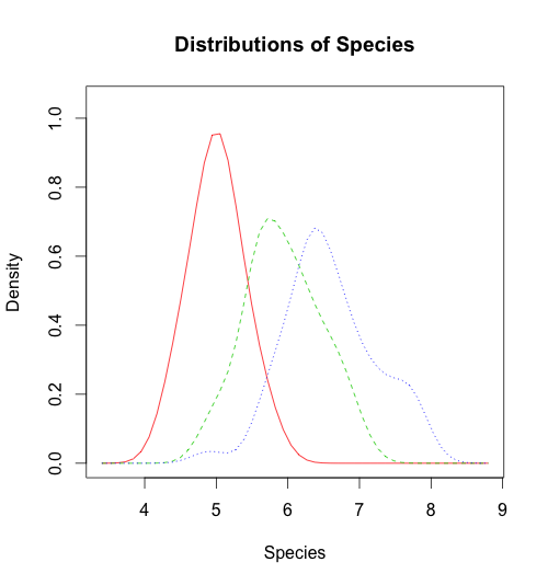
In this example, I am using iris data set and comparing the distribution of the length of sepal for different species. After you load the dataset run the code below to build the density plot.
sm.density.compare(iris$Sepal.Length, iris$Species, xlab="Species")
title(main="Distributions of Species")
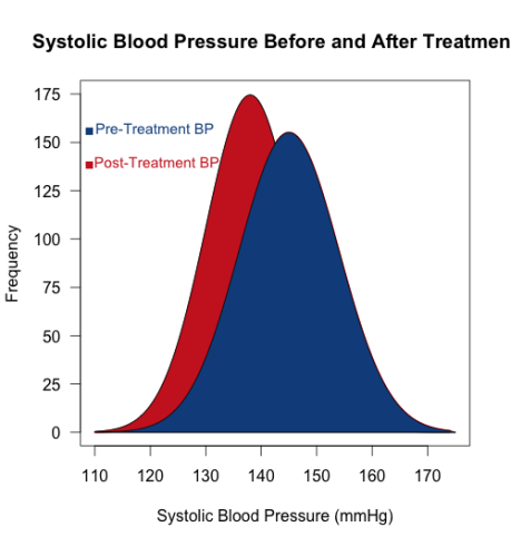
To make a fancy density plot, Chris shared a R script with us:
x <- seq(from = 110, to = 174, by = 0.5)
y1 <- dnorm(x, mean = 145, sd = 9)
y2 <- dnorm(x, mean = 138, sd = 8)
plot(x, y1, type="l", lwd=2, col="red",
     main="Systolic Blood Pressure Before and After Treatment",
     xlab = "Systolic Blood Pressure (mmHg)",
     ylab = "Frequency", yaxt="n",
     xlim = c(110, 175), ylim = c(0, 0.05))
lines(x, y2)
polygon(c(110,x,175),c(0,y2,0), col="firebrick3",
     border = "black")
polygon(c(117,x,175),c(0,y1,0), col="dodgerblue4",
     border = "black")
ylab=c(seq(from=0, to=175, by=25))
y=c(seq(from=0, to=0.05, length.out = 8))
axis(2,at=y,labels=ylab, las=1)
text(x = 120, y = 0.045, "- Pre-Treatment BP", col = "dodgerblue4", cex = 0.9)
text(x = 120, y = 0.04, " - Post-Treatment BP", col = "firebrick3", cex = 0.9)
points(109, 0.0445, pch = 15, col = "dodgerblue4")
points(109, 0.0395, pch = 15, col = "firebrick3")
Here is the plot:

I hope you understand the script above, if not, please leave a comment and we will be happy to assist.
