This is the second part of a three-part article recently published in DataScience+. Part 1 covered HTML Processing using Python. Part 2 dives into the applications of two applied clustering methods: K-means clustering and Hierarchical clustering. Applied clustering is a type of unsupervised machine learning technique that aims to discover unknown relationships in data. Part 3 covers the applications of another type of unsupervised machine learning technique, principal component analysis.
Motivation
Unsupervised machine learning refers to machine learning with no prior knowledge about the classification of sample data. Unsupervised learning algorithms are expected to extract knowledge from data without being given a response/target variable. In Wikipedia, unsupervised learning has been described as “the task of inferring a function to describe hidden structure from ‘unlabeled’ data (a classification of categorization is not included in the observations)”. Applied clustering aims to describe the hidden structure of the objects so that data insights can be geared towards improving business processes. There are many real-world examples of applied clustering including segmentation of customer types and purchase behaviors. Applied clustering shows broader applications in bioinformatics and image analysis, among others.
Python offers many algorithms for unsupervised machine learning. The first section of this article illustrates a popular algorithm called K-means method of cluster detection, leveraging the sklearn.cluster module. As an alternative to K-means, the later section of this post covers hierarchical method of cluster detection, leveraging the scipy.cluster.hierarchy module. The expectation is that sets of countries within a cluster are as similar as possible to each other for happiness and social progress, and as dissimilar as possible to the other sets of countries assigned in different clusters.
Load Required libraries
import pandas as pd
import numpy as np
import matplotlib.pyplot as plt
%matplotlib inline
import seaborn as sns
from sklearn.preprocessing import scale
from scipy.cluster.hierarchy import dendrogram, linkage, fcluster
from sklearn.cluster import KMeans
Load the dataset
The dataset for this article was scraped from a Wikipedia webpage using python code described in Part 1. For convenience, a copy of the dataset has been uploaded here.
Load a copy of the dataset in memory and check for the structure of the dataset.
df = pd.read_csv('C://Users//xxxx//parsing_HTML//world_happiness_data19.csv')
print(f"The table contains: {df.shape[0]} rows and {df.shape[1]} columns")

The table contains: 156 rows and 9 columns
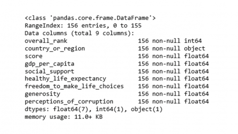
The data table contains 156 rows of countries of the world in 9 features. Feature names and associated data types can be revealed using info().
df.info()
Sometimes it may be necessary to exclude variables from a dataset. The following code will drop the rank and score features from the dataset.
df = df.drop(['overall_rank','score'], axis=1)
Dataset Exploration
Code to view the contents of the top rows of the dataset.
df.head()
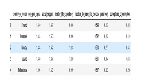
Code to display the contents of the last rows of the dataset.
df.tail()
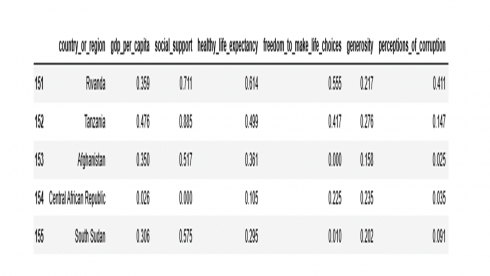
Are there any missing data values?
df.isnull().sum()

country_or_region 0
gdp_per_capita 0
social_support 0
healthy_life_expectancy 0
freedom_to_make_life_choices 0
generosity 0
perceptions_of_corruption 0
dtype: int64
No, there are no missing data values.
It is a good idea to start data analysis by looking at data distribution to see if it follows a normal distribution. A histogram is a convenient way to determine how the distribution of the data is shaped, and if data distribution follows assumed normal distribution or not.
numerical_features = ['gdp_per_capita', 'social_support', 'healthy_life_expectancy',
       'freedom_to_make_life_choices', 'generosity',  'perceptions_of_corruption']
fig, ax = plt.subplots(2, 3, figsize = (18, 12))
sns.set(style="whitegrid")
for i, ax in enumerate(fig.axes):
    for j, col in enumerate(df[numerical_features]):
        if i == j:
            sns.distplot(df[numerical_features][col], ax=ax)
plt.show()
Produces this figure!
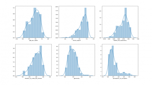
From the histograms above, data distribution for social support looks left-skewed, whereas data distribution for perception of corruption looks right-skewed. One can also perform a statistical measure of the shape of the data distribution using skewness statistic as shown in the code below.
df[numerical_features].skew()

gdp_per_capita                 -0.392948
social_support                 -1.135544
healthy_life_expectancy        -0.614835
freedom_to_make_life_choices   -0.681315
generosity                      0.719464
perceptions_of_corruption       1.648547
dtype: float64
A skewness measure of close to 0 signifies a data distribution that is approximately symmetric (normal distribution). Negative skew statistic is an indication of left-skewed distribution (for example, social support), whereas positive skew statistic indicates right-skewed distribution (for example, perceptions of corruption).
Box plot is another useful tool that provides visual information about data variability and the extreme data values.
df1 = pd.melt(df, id_vars='country_or_region', value_vars=df[numerical_features])
plt.figure(figsize=(8,6))
sns.set(style="whitegrid")
sns.boxplot(y='variable',x='value', data=df1, palette="Set2")
plt.show()
Produces this figure!
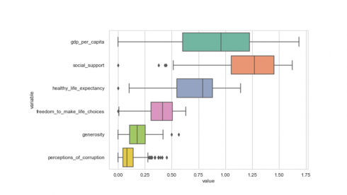
The middle 50% of the data, ranging from the first quartile to the third quartile (25th to 75th percentile values), is being represented by the box and the line inside each box is the median for that feature.
Importance of scale during applied clustering
Clustering methods are said to be sensitive to the units of measurement. In general, those features with large variance tend to have more influence on cluster formation than features with small variance. Assume a dataset consisting of features in different units, such as age, currency, weight, height, width, among others. Ideally you would want unit of change to represent the same degree of difference across features. A common practice to control the impact of scale in cluster analysis is to implement data standardization before clustering.
Python offers several functions for data transformation and scaling. An example of using the scale() function that transforms all variables to the same magnitude by scaling the data to a mean of 0 and standard deviation of 1 is shown in the code below.
df_scaled = scale(df[numerical_features])
Create a copy of the transformed dataset and plot the transformed data as a box plot.
df2 = pd.DataFrame(df_scaled, columns=numerical_features)
df2['country_or_region'] = pd.Series(df['country_or_region'], index=df.index)
df3 = pd.melt(df2, id_vars='country_or_region', value_vars=df2[numerical_features])
plt.figure(figsize=(8,6))
sns.set(style="whitegrid")
sns.boxplot(y='variable',x='value', data=df3, palette="Set2")
plt.show()
Produces this figure!
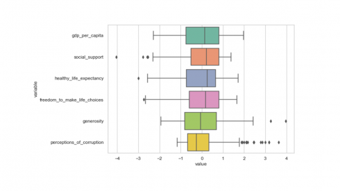
From the box plot above, we can clearly see that values of all variables in the dataset have been scaled to the same magnitude as desired. Confirm with the describe() function if the variables have been scaled to a mean and standard deviation of 0 and 1, respectively.
df2[numerical_features].describe().loc[['count','mean','std']].round(2)
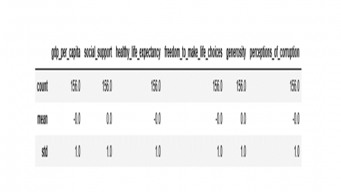
The transformed data is ready for cluster analysis.
K-means Clustering
The implementation of K-means clustering in scikit – learn library starts with instantiating the KMeans() class into an object. Running KMeans() in python prints the default settings as shown below.
print(f"Parameters of kmeans in scikit - learn:\n {KMeans()}")

Parameters of kmeans in scikit - learn:
KMeans(algorithm='auto', copy_x=True,
init='k-means++', max_iter=300,
n_clusters=8, n_init=10,
n_jobs=None, precompute_distances='auto',
random_state=None, tol=0.0001, verbose=0)
This step is when we set clustering parameters. For example, the n_clusters=8 from the code output above indicates that the algorithm is set to create 8 clusters by default. This may not be the case for every dataset. So, pre-specifying the number of desired clusters (n_clusters=) as an input is a prerequisite in k-means clustering. The practical issue is what value should n_clusters take? There are many approaches to choose a value for n_clusters, including:
a) Practical consideration regarding your business products, services, or programs (Say you have three products or services or programs, and hence you decide to create three customer segments).
b) Convenience (For no reason, you may find it convenient to create three segments such as high, medium, and low).
c) Subject-matter knowledge might suggest there are most likely x number of clusters.
d) Empirical approaches such as the elbow method as illustrated below.
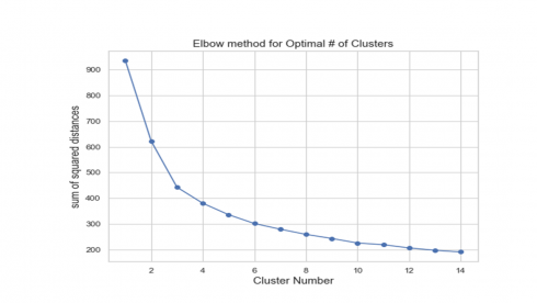
The elbow method of choosing the number of clusters relies on calculating the sum of squared distances (ssd) between each member of the cluster and its centroid and plotting it against a range of cluster numbers.
ssd = []
K = range(1,15)
for k in K:
    km = KMeans(n_clusters=k).fit(df2[numerical_features])
    ssd.append(km.inertia_)

plt.figure(figsize=(8,6))
plt.plot(K, ssd,'bo-')
plt.xlabel('Cluster Number', fontsize=14)
plt.ylabel('sum of squared distances', fontsize=14)
plt.title('Elbow method for Optimal # of Clusters', fontsize=14)
plt.show()
The sum of squared distances calculated for a range of 14 clusters is shown in the figure above. Calculated ssd decreased with increasing number of cluster groups, suggesting that objects in the data were getting much closer to the cluster centroids they were assigned to. Perhaps, the value of K (number of clusters) where ssd begins to decrease most rapidly is located to the left of K=6. So, in the code below, we set n_clusters to take a value of 5.
Besides pre-specifying the number of clusters, we can also override the other default parameters as shown in the example code below.
a) We set the parameter init to ‘random’ instead of the default KMeans++. This is for choosing the observations (rows) at random for the initial centroids.
b) We set the parameter n_init to 20 instead of the default 10. This is for the number of times the k-means algorithm will be run with different centroid seeds.
c) We set the parameter max_iter to 600 instead of the default 300. This is the maximum number of iterations of the k-means algorithm for a single run.
d) We set the random_state to 234. If you want to replicate the clustering output from this post, you need to use the same random seed as shown here.
Using the parameters listed above in conjunction with the other default settings, the code below will instantiate a k-means class into an object called kmeans5, followed by a call to the fit method with the dataset. The outputs of these steps include cluster group labels (cluster membership), among others.
kmeans5 = KMeans(n_clusters=5, init='random', n_init=20, max_iter=600,  random_state=234)

kmeans5.fit(df2[numerical_features])
print(f"KMeans Cluster Memberships:\n {kmeans5.labels_}")

KMeans Cluster Memberships:
[1 1 1 1 1 1 1 1 1 1 1 2 2 1 1 1 1 1 2 2 1 1 2 2 2 2 2 2 1
2 2 2 2 1 2 3 2 2 2 2 1 3 2 2 2 0 2 2 2 2 0 0 3 3 2 2 2 2 0
2 2 3 2 2 2 2 4 3 2 3 3 2 3 0 3 1 2 3 3 2 3 3 2 2 4 0 2 3 3
3 3 0 2 2 0 4 3 4 4 0 3 4 4 3 0 3 3 3 0 3 4 4 3 4 4 3 0 4 3
4 0 3 4 3 0 3 4 4 4 2 0 4 3 4 4 4 3 0 4 0 4 4 4 4 4 4 4 3 4
4 4 0 0 4 4 4]
You may want to know how many countries have been grouped in each K-means cluster.
KCluster, counts = np.unique(kmeans5.labels_, return_counts=True)
print(f"Cluster # vs Count: \n {np.asarray((KCluster, counts))}")

Cluster # vs Count:
 [[ 0  1  2  3  4]
 [19 22 46 34 35]]
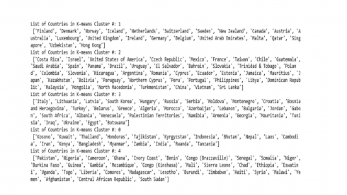
The number of countries assigned in each cluster is displayed above. Cluster 2 has highest number of countries, whereas cluster 0 contains the lowest number of countries. Please note that in clustering, we should not assign any significance to the cluster numbers per se. The only legit information that a cluster group assignment provides is that countries listed in the same cluster are somewhat similar for the features under consideration.
The code below shows a list of countries in each cluster by K-means clustering.
df2['Kcluster'] =  pd.Series(kmeans5.labels_, index=df.index)
for m in df2['Kcluster'].unique():
    tt = df2[['Kcluster','country_or_region']][df2['Kcluster']==m]
    print(f"List of Countries in K-means Cluster #: {m} \n {list(tt['country_or_region'])}")
Hierarchical clustering
The application of hierarchical clustering in python is mediated through the scipy.cluster module leveraging the linkage and dendrogram functions. Unlike k-means, hierarchal clustering does not require pre-specifying the number of clusters to be generated. Hierarchal clustering starts with calculating a distance array using one of the linkage options. The question is what type of linkage option should be used? In this post we will implement the ward option (Discussion of the different linkage options is out of scope. Reviewing the literature, looks like the resulting dendrogram appears to depend on the type of linkage used).
dist =linkage(df2[numerical_features],'ward')
The above code returns a linkage data array in a variable named dist, which will be used as an input to create a dendrogram.
The code below is to plot the hierarchical cluster as a dendrogram (cluster tree).
dendrogram(dist,truncate_mode="lastp", p=8, leaf_rotation=90, leaf_font_size=18, show_contracted=False)
plt.axhline(y=10, color='black', linestyle='--') # maxium distace for cluster cut-off
plt.axhline(y=14, color='black', linestyle='--') # maxium distace for cluster cut-off
plt.title('Dendrogram of Hierarchical Cluster Assignment', fontsize=14)
plt.xlabel('Number of Coutries', fontsize=16)
plt.ylabel('Cluster Distance', fontsize=16)
plt.show()
Produces this cluster tree!
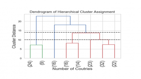
The above tree is a visual representation of the hierarchical clustering of the 156 countries. The numbers in parenthesis correspond to the number of countries assigned in each tree node.
Another consideration in hierarchical clustering is where to cut the dendrogram in order to decide on the number of distinct clusters formed? Looking at the above dendrogram, where to cut the dendrogram is not entirely clear. For example, cutting the dendrogram at the heights of 14 and 10 suggested 4-cluster or 5-cluster solutions, respectively. Although determining the best number of clusters based on where to cut the dendrogram looks as much art than science, the resulting cluster tree looks neat.
The following code outputs hierarchical cluster membership of the 156 countries in the dataset.
# Chose a maximum distance of 10 to form a five-cluster solution
Hclusters = fcluster(dist, 10, criterion='distance')
print(f"Hierarchical Cluster Memberships:\n {Hclusters}")

Hierarchical Cluster Memberships:
[2 2 2 3 2 2 2 2 2 2 2 5 5 2 2 2 2 5 3 5 3 3 5 5 5 5 5 5
3 5 5 5 5 2 5 5 3 5 3 5 3 5 5 5 3 3 5 5 5 5 3 3 5 5 5 5
3 5 3 5 5 5 5 5 5 5 1 5 5 5 4 5 5 3 5 2 5 4 5 3 5 4 3 5
1 3 3 4 4 5 5 3 5 5 3 1 5 1 1 3 5 1 1 4 3 4 4 5 3 4 4 3
4 1 1 4 4 1 4 1 1 4 1 4 3 4 1 1 1 3 3 1 4 1 4 1 4 1 1 3
1 1 1 4 1 1 1 4 1 1 4 3 1 1 1 1]
How many countries were grouped in each hierarchical cluster?
HCluster, counts = np.unique(Hclusters, return_counts=True)
print(f"Cluster # vs Count: \n {np.asarray((HCluster, counts))}")

Cluster # vs Count:
 [[ 1  2  3  4  5]
 [33 16 30 23 54]]
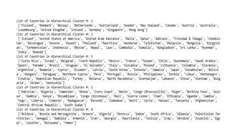
Cluster # 5 has the largest number of countries (54) vs cluster # 2 has the lowest number of countries (16).
The code below shows a list of countries in each cluster by the Hierarchical clustering.
df2['Hcluster'] =  pd.Series(Hclusters, index=df.index)
for m in df2['Hcluster'].unique():
    tt = df2[['Hcluster','country_or_region']][df2['Hcluster']==m]
    print(f"List of Countries in Hierarchical Cluster #: {m} \n {list(tt['country_or_region'])}")
Agreement between the two clustering methods
Curious to know how the cluster assignment of the 156 countries compared between K-means vs Hierarchical clustering methods? This is for you.
mt2 = pd.crosstab(Hclusters, kmeans5.labels_, normalize='columns').T.add_prefix('clust_')
maxval = mt2.idxmax(axis=1)
maxclust = mt2.max(axis=1)
last = pd.concat([maxval, (maxclust*100).round()], axis=1).reset_index()
last.columns=['Kcluster_group', 'Hcluster_group', 'Percent_agreement']
print(last.to_string(index=False))
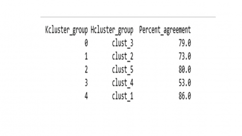
Overall there is a 74.3% agreement between K-means and Hierarchical cluster groups.
In Summary
Clustering methods are usually applied to dataset that does not contain any label information as well as dimension reduction because the entire dataset can be represented by a small number of clusters. The goal in this example dataset was to group observations into a distinct number of clusters. The expectation was that sets of countries within a cluster are as similar as possible to each other regarding happiness and social progress, and as dissimilar as possible to the other sets of countries assigned in different clusters. Often, applied clustering efforts are followed by building predictive models for the likelihood of distinct cluster membership. Learning a new representation of the data can sometimes improve the accuracy of predictive models or can lead to reduced memory and time consumption during model development.
