Prices are subject to analysis in different fields such as agriculture, labor, housing, and many others. The financial market is not an exception, and consequently, the prices of the assets involved in its world such as stocks and bonds are needed for many purposes in economics and finance. In this article, I explain how to get prices for several stocks using R package quantmod and plot them using ggplot2.
quantmod has its own plotting tools that are useful for algorithmic trading and technical analysis (for advanced visualizations on algorithmic trading you can see Visualizations for Algorithmic Trading in R). Nevertheless, if you just want to plot time series with no extra information ggplot2 provides easier and flexible options for formatting. This exercise consists of 1) getting stock prices for 3 top US banks from the beginning of February to the end of March and 2) plotting the time series including the following details:
- Title and subtitle
- x and y labels
- Caption
- Colors according to each bank
Loading required Packages
library(quantmod)
library(ggplot2)
library(magrittr)
library(broom)
First, let’s set the dates for the period to plot
start = as.Date("2020-02-01")
end = as.Date("2020-03-31")
Getting data
Now I request quantmod to get the stock prices for Citibank (C), JP Morgan Chase (JPM), and Wells Fargo (WFC).
The function getSymbols will get the data for you using 3 main arguments: the ticker of the companies, the source of the data, and the period.
Now provide to getSymbols the inputs for the arguments. If you want more than one company you can add using the vector command c().
getSymbols(c("JPM", "C", "WFC"), src = "yahoo", from = start, to = end)
getSymbols generate 3 xts objects with an index column to reference the date, and 6 additional columns with the following information: open, high, low, close, volume, and adjusted. You can see the first lines of the object using the following command:
head(WFC)
           WFC.Open WFC.High WFC.Low WFC.Close WFC.Volume WFC.Adjusted
2020-02-03    47.24    47.72   47.03     47.12   15472000     46.62256
2020-02-04    47.70    47.84   47.25     47.26   14973300     46.76108
2020-02-05    47.90    48.40   47.78     48.31   20141800     47.80000
2020-02-06    48.44    48.50   47.85     47.98   18259200     47.98000
2020-02-07    47.73    48.00   47.48     47.84   13174600     47.84000
2020-02-10    47.67    47.86   47.42     47.77   18124800     47.77000
The next step is to create a data frame that captures all rows with just the adjusted price column of each bank. The adjusted price is used to account for dividend payments. This data frame is transformed into a time series object with the function as.xts().
stocks = as.xts(data.frame(C = C[, "C.Adjusted"], JPM = JPM[, "JPM.Adjusted"], WFC = WFC[, "WFC.Adjusted"]))
            Citi JP Morgan Wells Fargo
2020-02-03 75.13  131.9984    46.62256
2020-02-04 76.50  133.8986    46.76108
2020-02-05 78.85  136.1749    47.80000
2020-02-06 78.97  136.1947    47.98000
2020-02-07 78.69  135.7593    47.84000
2020-02-10 78.48  136.3234    47.77000
Stocks is an xts object with an index column for date reference and 3 columns for adjusted stock prices. Now is required to do two additional transformations to stocks before plotting. 1) Assigning names to the columns given that at this point ggplot2 will read them as 1, 2, and 3. So first I assign the bank name, then 2) define the index column as a date.
names(stocks) = c("Citi", "JP Morgan", "Wells Fargo")
index(stocks) = as.Date(index(stocks))
Plotting
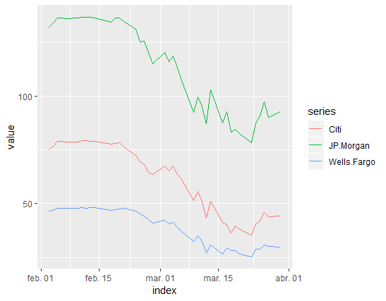
Now I can plot using ggplot2. The 3 main arguments will be the dataset stocks, aes() which indicate that dates are assigned to x-axis and values to the y-axis, and color that assigns a color to the 3 series. Color is the argument that makes it possible to include more than one time series in the plot.
After providing the 3 main arguments, I add the layer for the shape of the plot. I want a line as it is the most appropriate for time series, so I add the command geom_line().
stocks_series = tidy(stocks) %>%

  ggplot(aes(x=index,y=value, color=series)) + geom_line()

stocks_series
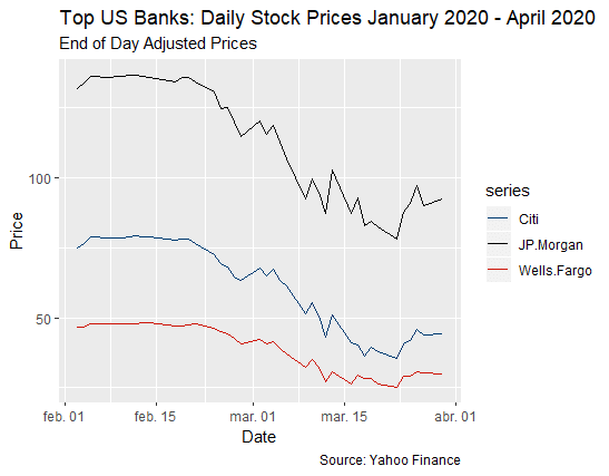
This is a basic version, so I include more details with the following commands:
labs() allows to include title, subtitle, and caption in a single code.
xlab() and ylab(), to name axis, I set “Date” for x and “Price” for y.
scale_color_manual() to change the colors of the lines, I use colors that are representative of each bank.
stocks_series1 = tidy(stocks) %>%

  ggplot(aes(x=index,y=value, color=series)) + geom_line() +
  labs(title = "Top US Banks: Daily Stock Prices January 2020 - April 2020",

            subtitle = "End of Day Adjusted Prices",
            caption = " Source: Yahoo Finance") +

  xlab("Date") + ylab("Price") +
  scale_color_manual(values = c("#003B70", "#000000", "#cd1409"))

stocks_series1
I hope this little “how to” is useful for you!!
Cheers!
Andrés