Most of figures and plots that I find on research papers are 2-dimensional (i.e., x-axis y-axis), but sometimes, I prefer to visualize three valiables simultaneously and to know how they are related to each other. For this purpose, I found a -new to me- package named scatterplot3d. As usual, I will use the NHANES data which are publically available. The objective of this post is to show how to build a 3-dimensional plot in R.
Packages and Data
Load the libraries:
library(scatterplot3d)
library(tidyverse)
library(RNHANES)
Here is my dataset and the variables I selected are:
- SEQN: id
- RIDAGEYR: age in years
- BMXBMI: body mass index
- BMXHT: body height
- BMXWT: body weight
- RIDRETH1: race/ethnicity
dat = nhanes_load_data("DEMO_F", "2009-2010") %>%
  select(SEQN, RIAGENDR, RIDAGEYR, RIDRETH1) %>%
  left_join(nhanes_load_data("BMX_F", "2009-2010"), by="SEQN") %>%
  select(SEQN, BMXHT, BMXWT, BMXBMI, RIDAGEYR, RIDRETH1) %>%
  mutate(
     BMI = ifelse(BMXBMI >= 25, "Overweight", "Normal weight"),
     Race = recode_factor(RIDRETH1,
                         `1` = "Hispanic",
                         `2` = "Hispanic",
                         `3` = "White",
                         `4` = "Black",
                         `5` = "Hispanic")
  ) %>%
  filter(!is.na(BMXBMI), RIDAGEYR > 30, RIDAGEYR < 35)
I included in my dataset individuls aged 30 to 35 years with available data in height, weight. Also, I keep race in the dataset because plan to group by race.
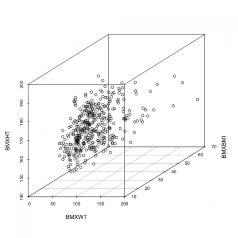
Let see the basic 3D scatter-plot:
with(dat,
     scatterplot3d(BMXWT,
                   BMXBMI,
                   BMXHT))
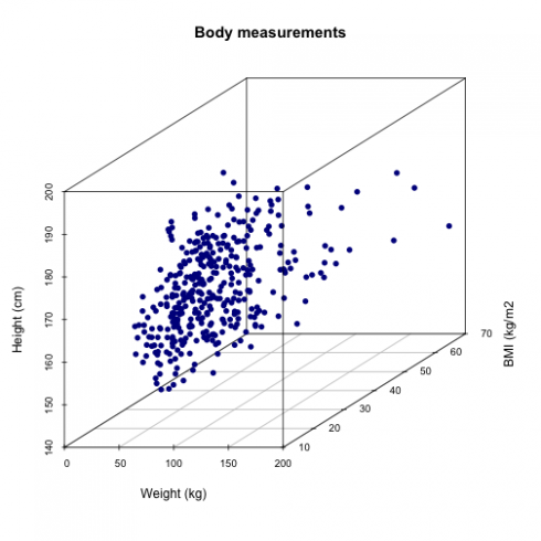
Add a title, change the labels and color the points of the scatter plot. For this, I will use the code below:
with(dat,
     scatterplot3d(BMXWT,
                   BMXBMI,
                   BMXHT,
                   main="Body measurements",
                   xlab = "Weight (kg)",
                   ylab = "BMI (kg/m2",
                   zlab = "Height (cm)",
                   pch = 16, color="darkblue"))
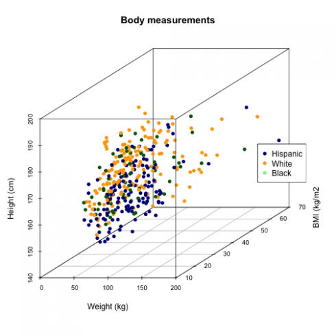
To see the difference in my variables by race, I group the data by race and assign three diferent colors given that I have only 3 races/ethnicity in my dataset:
cols <- c("darkblue", "orange", "darkgreen")
with(dat,
     scatterplot3d(BMXWT,
                   BMXBMI,
                   BMXHT,
                   main="Body measurements",
                   xlab = "Weight (kg)",
                   ylab = "BMI (kg/m2",
                   zlab = "Height (cm)",
                   pch = 16, color=cols[as.numeric(dat$Race)]))

legend("right", legend = levels(dat$Race),
      col =  c("darkblue", "orange", "lightgreen"), pch = 16)
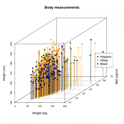
To see better the location of the points on the XY axis, I add bars with type="h"argument.
with(dat,
     scatterplot3d(BMXWT,
                   BMXBMI,
                   BMXHT,
                   main="Body measurements",
                   xlab = "Weight (kg)",
                   ylab = "BMI (kg/m2",
                   zlab = "Height (cm)",
                   pch = 16, color=cols[as.numeric(dat$Race)],type="h"))

legend("right", legend = levels(dat$Race),
      col =  c("darkblue", "orange", "darkgreen"), pch = 16)
The graph shows that White's are taller than the other two races, and the shortest people are the Hispanic's. The BMI is higher in those with higher weight regardless of the height!
Hope it is helpful!


