To improve the process selecting the best models and inspecting the results with visualizations, I have created some functions included in the lares library that boost the task. This post is focused on classification models, but the main function (mplot_full), also works for regression models.
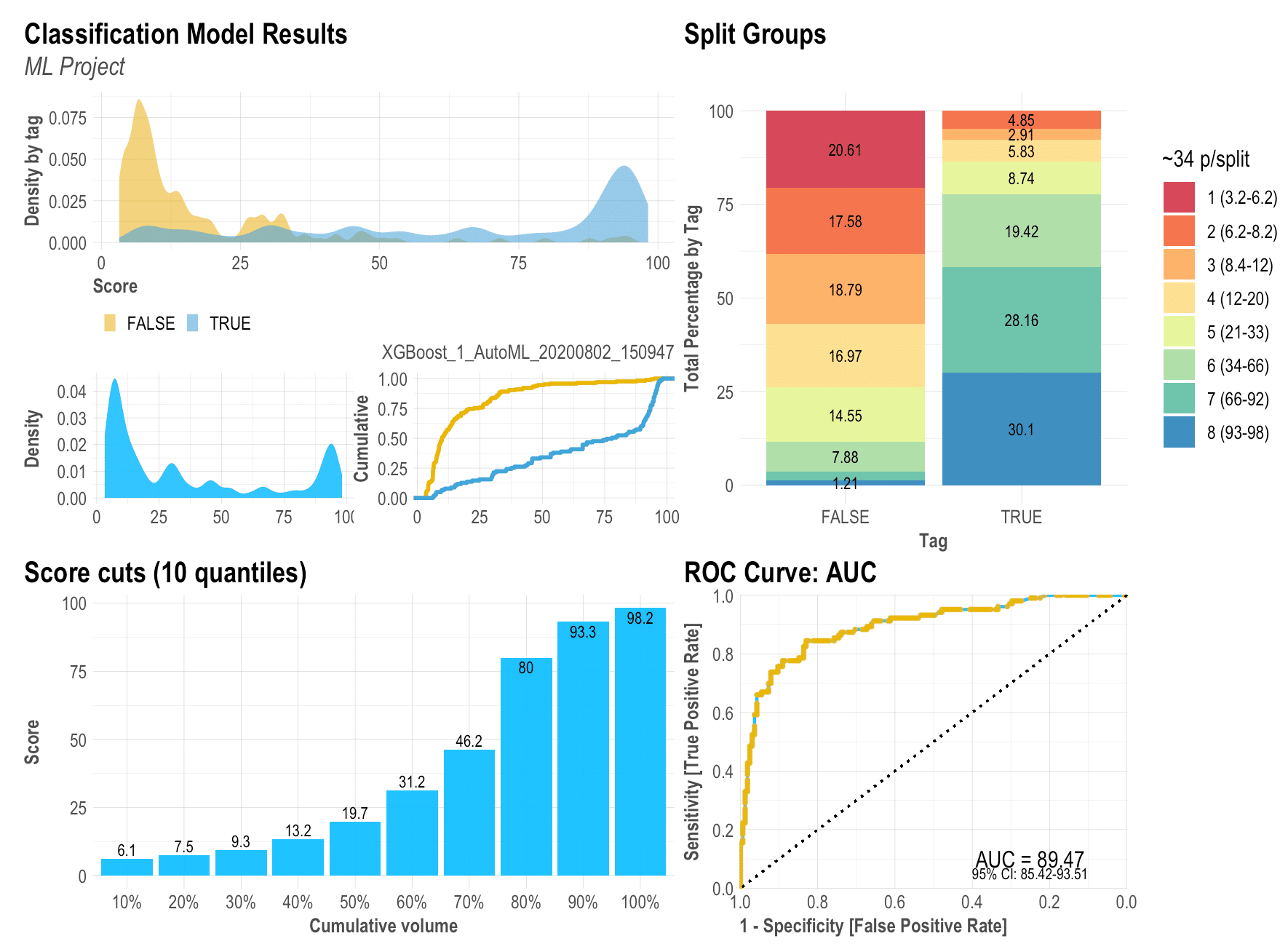
Before we start, let me show you the final outcome so you know what we are trying to achieve here with just a simple line of R code:
Now that (hopefully) you are excited with the outcome, let’s install the lares library so we can replicate all the visualizations:
install.packages('lares')
Remember that all of this post’s functions have their respective documentation which will give you more details on the arguments you may set as inputs. To access them, just run ?function_name. To train a model as I did, you may use the h2o_automl() function (documentation) to quickly have a good predictive model in seconds.
The results object
To create the visualizations we need to have at least the labels and scores for each categorical value. If you used h2o_automl() to train your model, you already have everything you’ll need and more in your trained object. There are some arguments that will let you customize stuff: your project’s name to be added in titles, thresholds for multi-categorical confusion matrix plot, number of splits, highlights, captions, etc.
So, when asked to provide ‘tag’ or ‘label’ for the functions, it would be your classifier’s real labels. When asked to provide the ‘score’, you should input the model’s result [continuous] values, results of the prediction.
Density Plot: mplot_density(label, score)
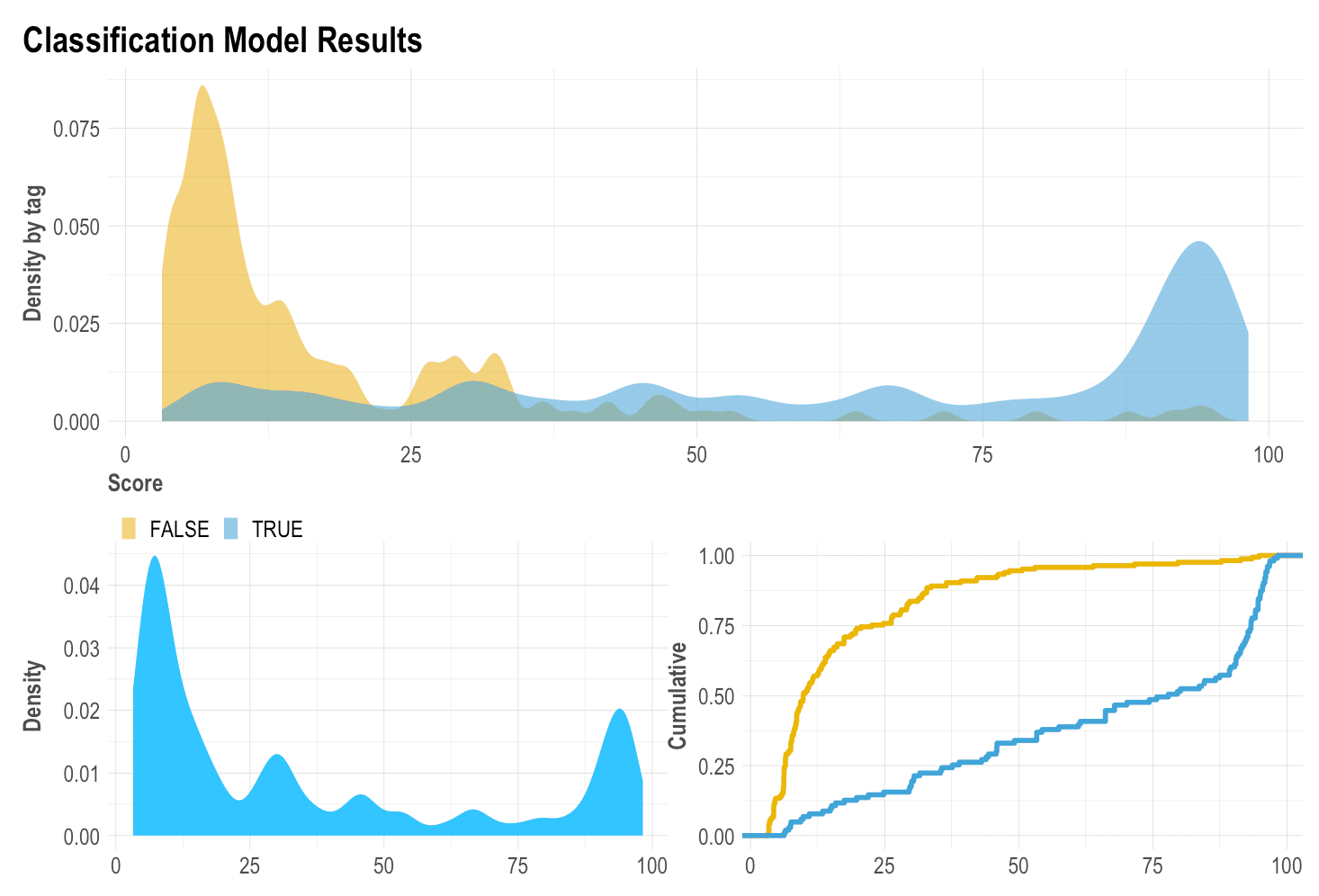
I have always given importance to the density plot because it gives us visual information on skewness, distribution, and our model’s facility to distinguish each class. Here we can see how the model has distributed both our categories, our whole test set, and the cumulative of each category (the more separate, the better).
ROC Curve: mplot_roc(label, score)
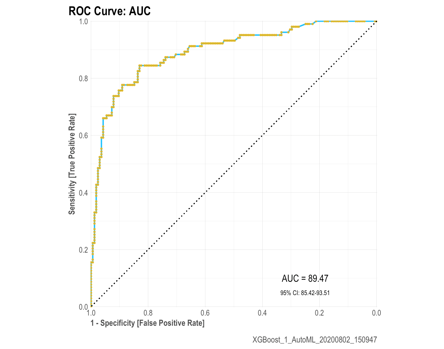
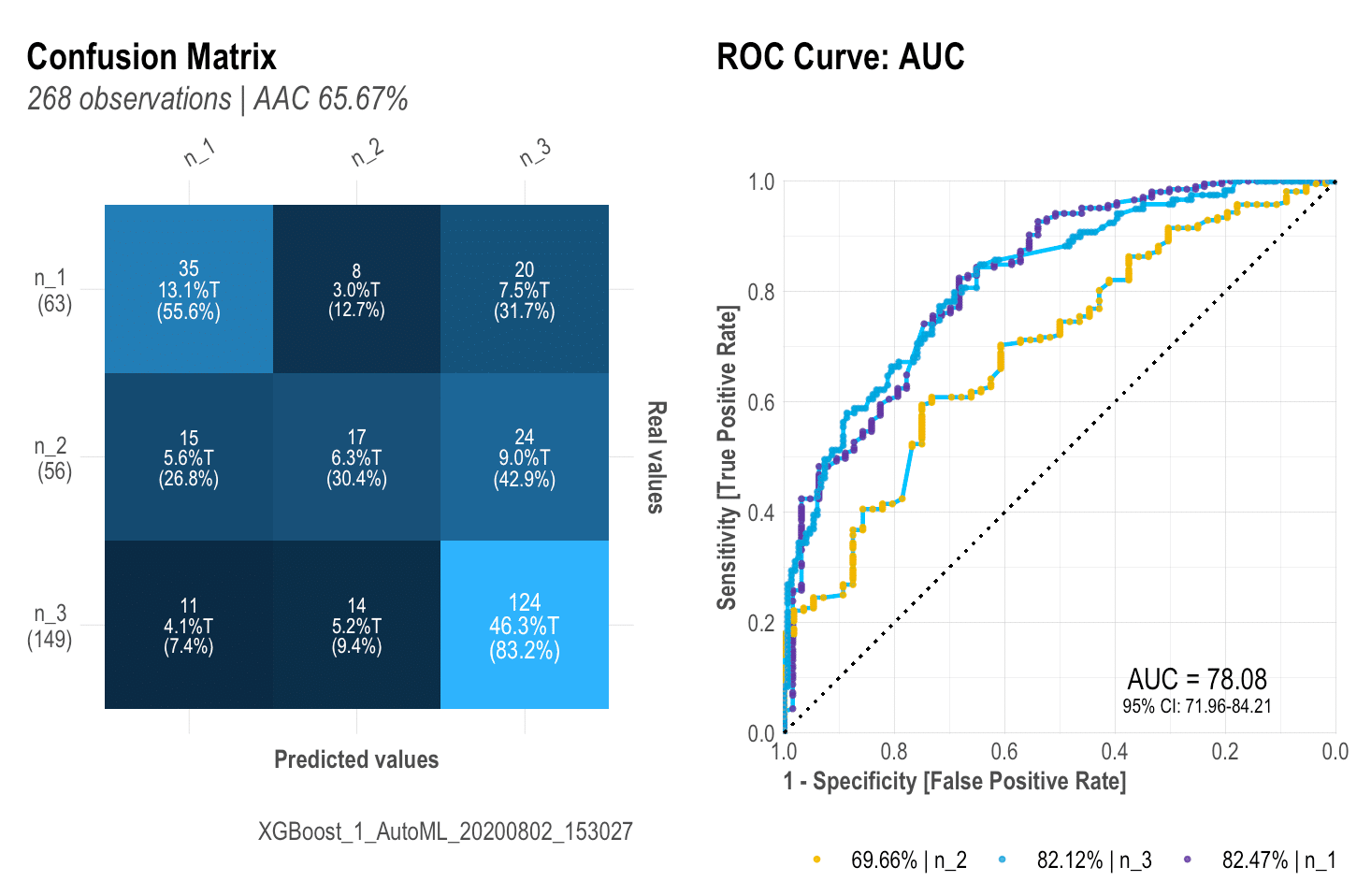
The ROC curve will give us an idea of how our model is performing with our test set. You should know by now that if the AUC is close to 50% then the model is as good as a random selector; on the other hand, if the AUC is near 100% then you have a “perfect model” (wanting or not, you must have been giving the model the answer this whole time!). So it is always good to check this plot and check that we are getting a reasonable Area Under the Curve with a nice and closed 95% confidence range.
Cuts by quantile: mplot_cuts(score)
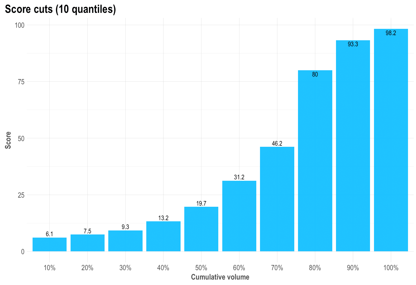
If we’d have to cut the score in n equal-sized buckets, what would the score cuts be? Is the result like a ladder (as it should), or a huge wall, or a valley? Is our score distribution lineal and easy to split?
Split and compare quantiles: mplot_splits(label, score)
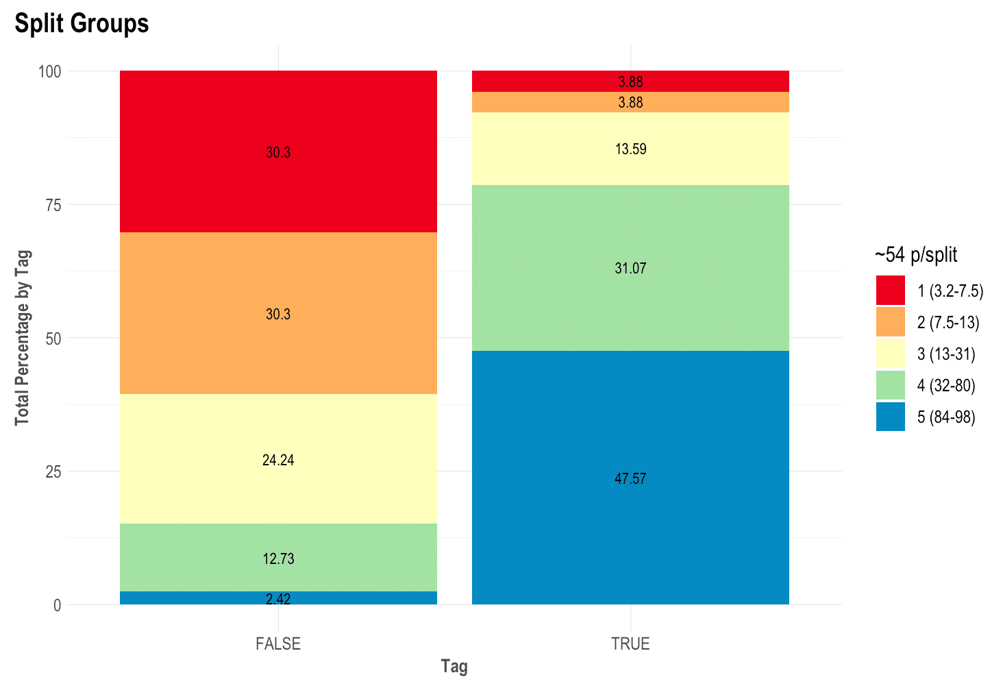
This parameter is the easiest to sell to the C-level guys. “Did you know that with this model, if we chop the worst 20% of leads we would have avoided 60% of the frauds and only lose 8% of our sales?” That’s what this plot will give you.
The math behind the plot might be a bit foggy for some readers so let me try and explain further: if you sort from the lowest to the highest score all your observations / people / leads, then you can literally, for instance, select the top 5 or bottom 15% or so. What we do now is split all those “ranked” rows into similar-sized-buckets to get the best bucket, the second-best one, and so on. Then, if you split all the “Goods” and the “Bads” into two columns, keeping their buckets’ colours, we still have it sorted and separated, right? To conclude, if you’d say that the worst 20% cases (all from the same worst colour and bucket) were to take an action, then how many of each label would that represent on your test set? There you go!
Finally, let’s plot our results: mplot_full(label, score)
Once we have defined these functions above, we can create a new one that will bring everything together into one single plot. If you pay attention to the variables needed to create this dashboard you would notice it actually only needs two: the label or tag, and the score. You can customize the splits for the upper right plot, set a subtitle, define the model’s name, save it in a new folder, change the image’s name.
This dashboard will give us almost everything we need to visually evaluate our model’s performance into the test set.
Multicategorical (+2 labels)
You can also use these functions for classifications non-binary models (more than 2 possible labels). Use the multis argument to pass each of your labels score. If you use the h2o_automl() function to train your models, you can set the argument as follows: multis = subset(your_dataframe, select = -c(tag, score)
BONUS 1: Gain and Response (2 or more labels)
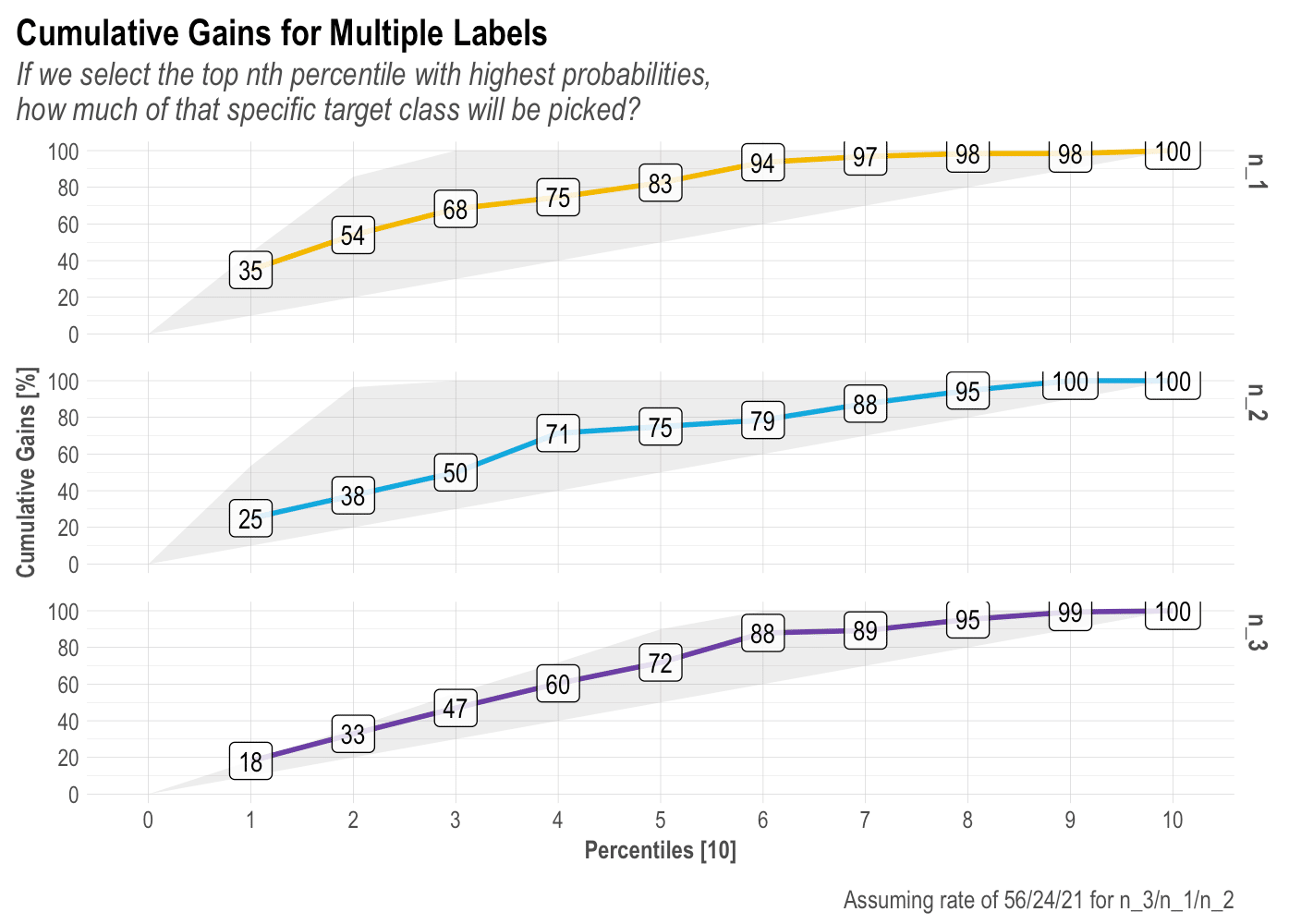
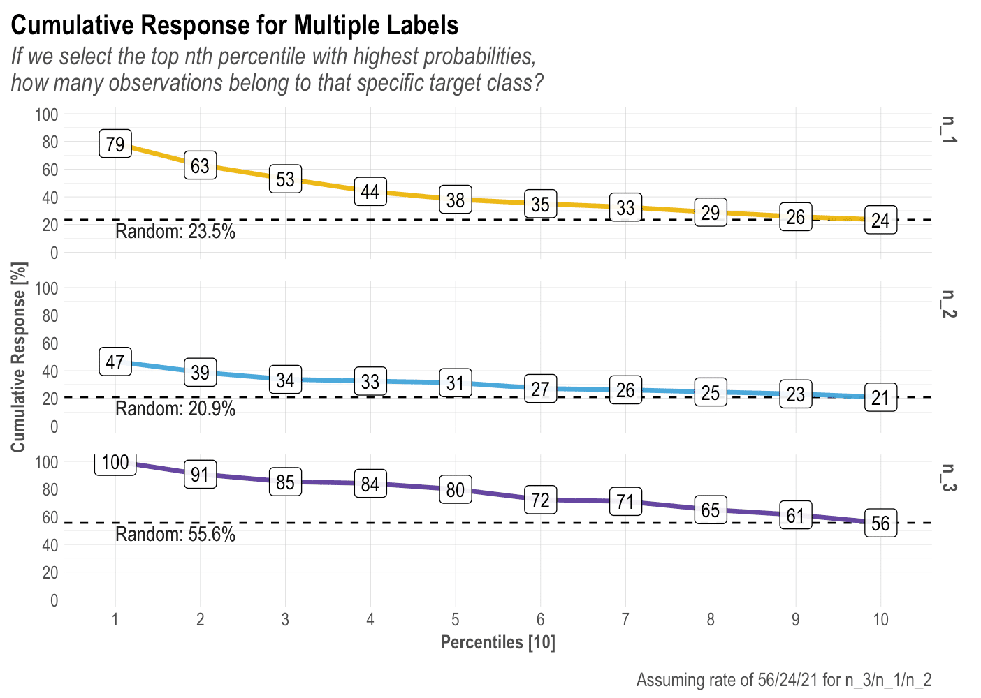
There is so much we can talk about these two plots, but I think I’ll leave that to a dedicated new post. In short, I think these are the most landed and value-centered visualizations to pitch our model results. Let’ check the plots for a 3-labels classification model:
mplot_gain(label, score, multis)
mplot_response(label, score, multis)
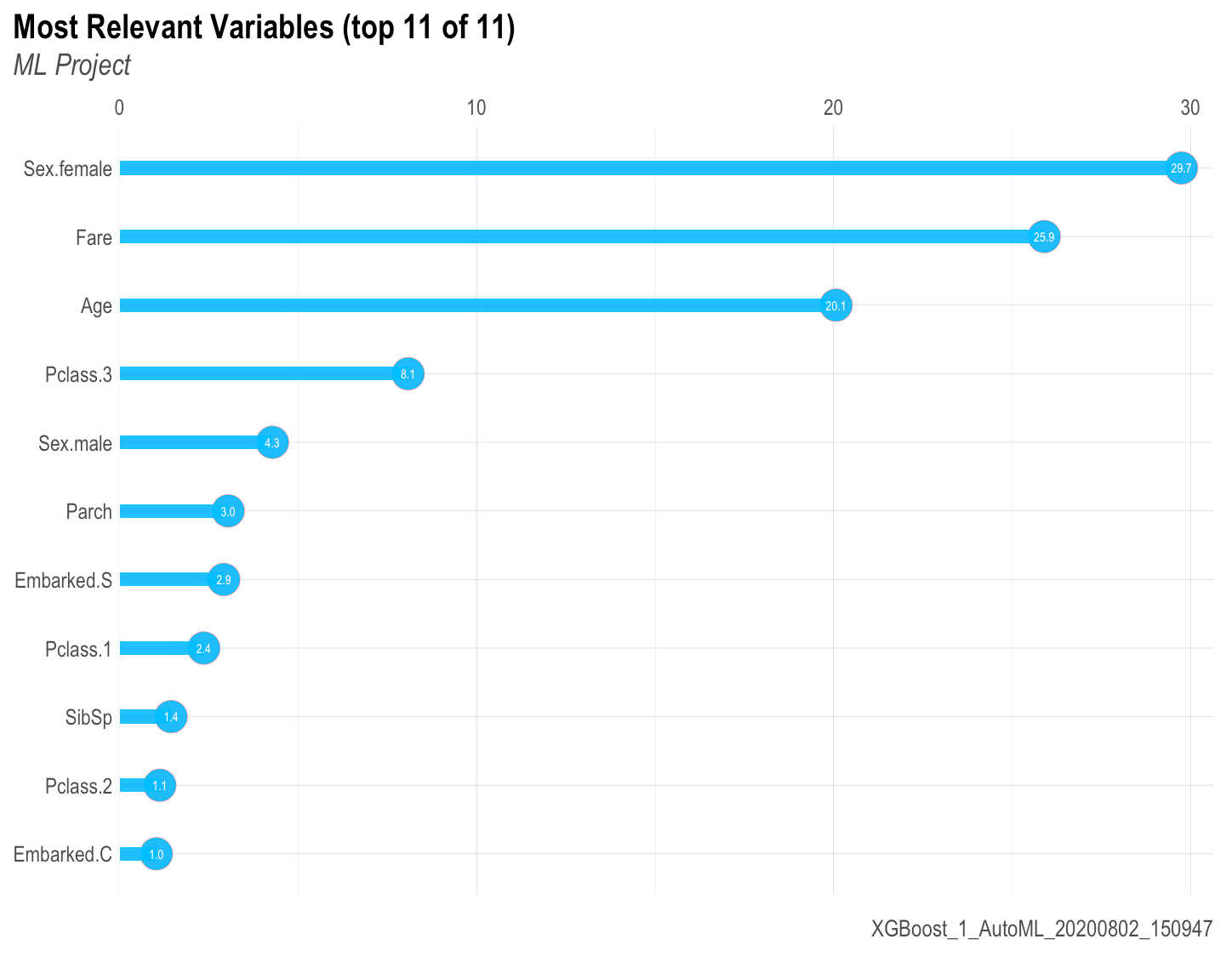
BONUS 2: Variables Importance: mplot_importance(var, imp)
If you are working with a ML algorithm that let’s you see the importance of each variable, you can use the following function to see the results:
Hope you guys enjoyed this post and any further comments or suggestions are more than welcome. Not a programmer here but I surely enjoy sharing my code and ideas! Feel free to connect with me in LinkedIn and/or write below in the comments.
Keep reading: Part 2 – Regression Models


Many thanks indeed for this wonderful contribution!! Very much appreciated.
So kind Mark! Glad to know 😉
Excellent post, and thanks very much for sharing all of these great visualizations!
Thanks Lars. Glad they worked up for you. Cheers!
Oh, you’ve got almost the same name as the library ;D
Haha 🙂
I’m now using a modified version of your ROC plot as a standard visual for my projects. Thanks very much!!
That’s great! Care to share? 🙂
Just switched the titling so the model name is below the main title…. https://uploads.disquscdn.com/images/895e50093587610a8e08c3098091ec9634dec53d7abeba082c27533b0a6a3832.png
Thank you Bernardo for sharing your library.
In plotting important variables, am not understanding the parameters in the function.I will appreciate if you can clarify .
Please do run ?lares::mplot_importance() and read. You have to pass the variable and the importance of each. The previous functions give you these values
Bernardo, thank you so much for the time you spent in developing this and sharing it with us. I use the caret package for training (train()) and then applying (predict()) my randomForest models. Can you suggest a way, or point me to an exampe, how to extract the outputs from caret for use with your lares package? Thanks again.
Thanks for your comment Iamochila. Just replied your email:
You may skip the caret package by simply using the lares library.. it will be way faster. But, if you already have your caret outputs, then you simple must use the real values on tag features and the predicted values on the score features. You may use the functions directly from the library.
Install it: devtools::install_github(“laresbernardo/lares”)
Then run lares::mplot_full(tag…score…)
That’s it. Cheers 🙂
Thanks for your comment Iamochila. Just replied your email:
You may skip the caret package by simply using the lares library.. it will be way faster. But, if you already have your caret outputs, then you simple must use the real values on tag features and the predicted values on the score features. You may use the functions directly from the library.
Install it: devtools::install_github(“laresbernardo/lares”)
Then run lares::mplot_full(tag…score…)
That’s it. Cheers 🙂
Another reproducible example:
library(lares)
library(mlbench)
data(“PimaIndiansDiabetes”)
df % rename(“tag” = “diabetes”)
results <- lares::h2o_automl(df, seed = 1)
mplot_full(tag = results$scores$tag,
score = results$scores$score,
subtitle = "Example using Pima Indians dataset",
model_name = results$model_name,
save = TRUE)
https://uploads.disquscdn.com/images/7edaa04be1baf45e86970f3fca6b77f47f2b3dc8e07a0f9e467f4dbfa4d36fe3.png
Does anyone else get this error?
Loading required package: ggplot2
Failed with error: ‘Package ‘ggplot2’ version 2.2.1 cannot be unloaded:
Error in unloadNamespace(package) : namespace ‘ggplot2’ is imported by ‘pROC’ so cannot be unloaded
’
Error in ggplot(out) : could not find function “ggplot”
Is there anyway I can replicate this example? Retry installing the library: devtools::install_github(“laresbernardo/lares”)
https://uploads.disquscdn.com/images/093910e724188d4250affe8218229df0eb65f0cb5d177a935c91e0d39f469aaa.png
Please try setting …, save = TRUE) in these mplot functions. They will be exported correctly in an image seen as the post’s images.. did you try that?
Thanks Lares for sharing your library of codes to generate various images to assess models. However, You need to make adjustment to the library to take care of the below errors.
In addition, since there is no option yet to format images, you have to ensure that lares::mplot_lineal() is well formatted. For example, see the image which is not legible at all!
Error in lares::mplot_cuts(score = pred) : object ‘tag’ not found
Error in lares::mplot_cuts(tag = y_act, score = pred) :
unused argument (tag = y_act)
Thanks for your comments Job.
– If you set save = TRUE in these mplot functions they will be exported correctly in an image seen as the post’s images.. did you try that?
– I think I fixed that some days ago.. please run devtools::install_github(“laresbernardo/lares”), close your RStudio and open it again. It should fix that!
Great post! Even better library! Thanks
Thanks for the compliment arlugones! I’m working on a very similar code that’ll do about the same but for a continuous output model (regressions). Keep in touch
I’m sharing this new one for linear regressions on Monday or Tuesday 🙂 https://uploads.disquscdn.com/images/3cb47b59a839a0ea5c35fc2a1ebd3f42b60133b05c883efaf0edeb5e8934d87b.png
Superb!
http://pzd.hmy.temporary.site/machine-learning-results-in-r-one-plot-to-rule-them-all-part-2-regression-models/
Great work! I already shared it through Twitter. Could you give us a reproducible example using your function?
Thanks Hoang. I can’t share this particular dataset but here is a reproducible example with for different dummy models to compare: http://bit.ly/taskML01
Many thanks, Bernardo! I am very impressed with your creativity and quality of your graphs and thanks for your reproducible example 🙂 It would be of great help if you could create a document attached in your package for your great function mplot_full()! Really appreciated your sharing! Once again, great job, Bernardo!
Thank you. Can you look at my project, so you can see if it is correct.
Where can I see your project? Sure Naeemah 🙂
https://github.com/naeemahaz/credit_card_marketing_model
The report and the notebook has been uploaded
Excellent Bernardo! I’ve already shared it
Thanks Pablo! I also love your funModeling work.. it is truly inspirational 😉
Very interesting, thank you for sharing. Are you planning to bring this to CRAN?
Glad you enjoyed it Holger. I’ve never uploaded anything in CRAN. Currently I have it hosted in Github. You can install it from there if you want (check the last line on the post). There are some other functions there that might also interest you!