The life cycle of Data science can never be completed without communicating the results of the analysis/research. In fact, Data Visualization is one of the areas where R as a language for Data science has got an edge over the most-celebrated Python. With ggplot2 being the de facto Visualization DSL (Domain-Specific Language) for R programmers, Now the contest has become how effectively one can use ggplot2 package to show visualizations in the given real estate.
In this tutorial, We will learn how to combine multiple ggplot plots to produce publication-ready plots. The R package that we are going to use is cowplot.
About the Package:
As mentioned in the package description, “The cowplot package is meant to provide a publication-ready theme for ggplot2, one that requires a minimum amount of fiddling with sizes of axis labels, plot backgrounds, etc. and also combining multiple plots into one figure and labeling these plots.”
Package Installation:
cowplot can be installed directly from CRAN using the following code:
install.packages("cowplot")
or the development version from github could be installed using either devtools or remote using the following code:
#install.packages("devtools")
devtools::install_github("wilkelab/cowplot")
Package Loading:
Once the package is installed, We can load cowplot using the following code (which is just like every other package loading in R):
library(cowplot)
library(ggplot2)
Building our First Combined Plot
The way it works in cowplot is that, we have assign our individual ggplot-plots as an R object (which is by default of type ggplot). These objects are finally used by cowplot to produce a unified single plot.
In the below code, We will build three different histograms using the R’s in-built dataset iris and then assign one by one to an R object. Finally, we will use cowplot function plot_grid() to combine the two plots of our interest.
#building the first plot

plot_histogram_SL <- ggplot(iris) +
  geom_histogram(aes(Sepal.Length), fill = "#eeff00", bins = 200)

#building the second plot

plot_histogram_PL <- ggplot(iris) +
  geom_histogram(aes(Petal.Length))


#building the third plot

plot_histogram_PL_SL <- ggplot(iris,aes(Petal.Length, Sepal.Length)) +
  geom_point(alpha = 0.2)


#Arranging Multiple Plots in Columns - 2 in 1

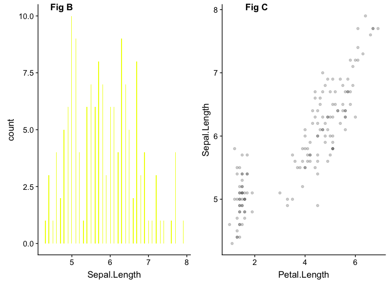
plot_grid(plot_histogram_SL,
          plot_histogram_PL_SL,
          labels = c('Fig B','Fig C'),
          label_x = 0.2,
          ncol = 2)
Gives this plot:
In the above plot, you could see those two plots being labelled with Captions/Labels Fig B and Fig C. These Labels were added with the Parameter labels in the plot_grid() function as it is mentioned in the above code,
There are other ways in which we can arrange the above made plots using cowplot. Let’s see a few examples:
Arranging Multiple Plots in Rows – 2 in 1
#Arranging Multiple Plots in Rows - 2 in 1

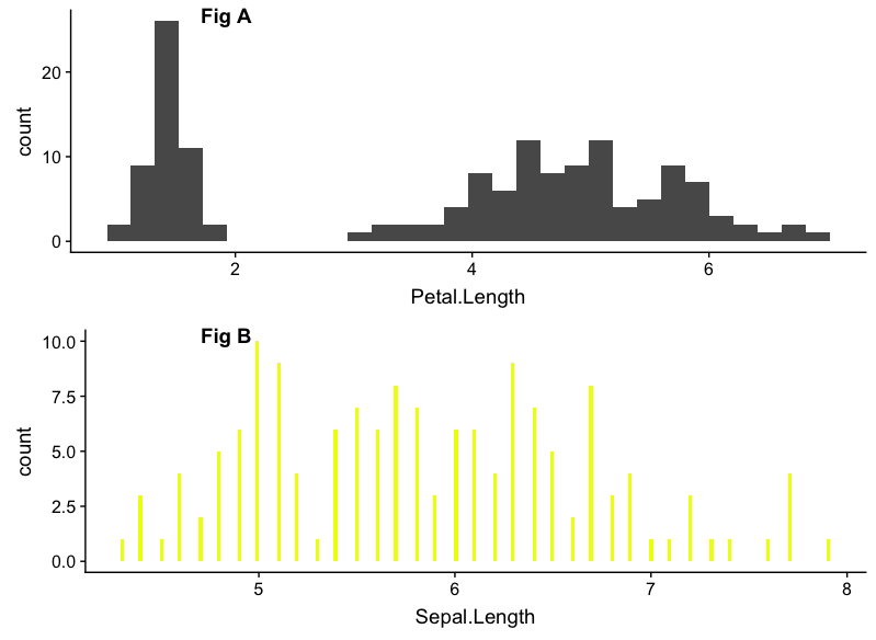
plot_grid(plot_histogram_PL,
          plot_histogram_SL,
          labels = c('Fig A','Fig B'),
          label_x = 0.2,
          nrow = 2)
Gives this plot:
A cowplot plot with ggplot – 3 in 1
#A cowplot plot with ggplot - 3 in 1


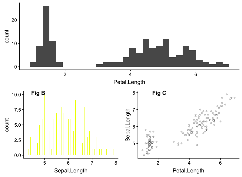
plot_grid(plot_histogram_SL,
          plot_histogram_PL_SL,
          labels = c('Fig B','Fig C'),
          label_x = 0.2,
          ncol = 2) -> new_p1

plot_grid(plot_histogram_PL,
          new_p1,
          #labels = c('Fig A','Fig B'),
          label_x = 0.2,
          nrow = 2)
Gives this plot:
As you can see in the above code, We have combined cowplot-combined plot with ggplot-generated plot. In this way, We can combine multiple ggplot plots in a variety ways based on the given real estate and business/use-case requirement. The entire code used here in this tutorial is available here on github. Check out DataCamp tutorial, if you are interested in knowing more about Data visualization in R.


